Design by Kathleen Matthews | Photo by Karen Palmer
If all this “staying at home” the past two years has taught us one thing, it’s this — to look at our surroundings with new eyes — to envision a home that meets our needs and makes us happy — to make our homes work for us, not against us — to truly enjoy being “at home.”
And so that begs the question…are you in love with your home?
- Is your kitchen more than just a place to make food? Is it a place to gather and connect with family and friends?
- Is your bedroom a true retreat — a place you look forward to at the end of the day, and a place that makes you happy when you wake up in the morning?
- Is your bathroom designed with tranquility in mind? Does it have enough storage? Have you included special touches like a beautiful chandelier or amazing tile that well…just makes you happy?
- Does the lighting in your home do more than just illuminate? Does it add to your sense of wellbeing?
- Do the colors in your home reflect your personality?
- Are your accessories thoughtfully chosen, and do they bring you joy?
Today, I’d like to share with you a few of the ways we’ve addressed each of these concerns and created homes that our clients truly love. We can do the same for you!
THE KITCHEN
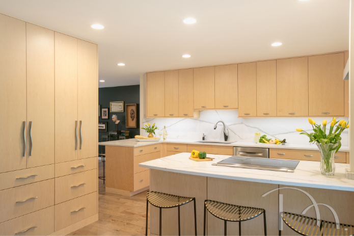
This contemporary kitchen remodel, resulted in a high-end and striking transformation. Open to the living room on one side and the dining room on the other, we decided that a minimalist aesthetic would keep the kitchen looking as large as possible and blend well with colors from the adjoining rooms. Light cabinetry and floors, quartz counters and backsplash, contemporary stainless hardware and fixtures, and unobtrusive, yet distinctive bar stools help this smaller kitchen live large.
See more of this kitchen here
Design by Marcia Moore | Photo by Suzy Gorman
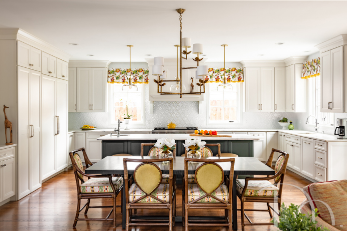
This brand new addition to our client’s home gave them a spacious, open concept kitchen, breakfast room and family gathering area. The large dining table, with its durable metal top is perfect for casual family dinners and can be dressed up if guests arrive. A favorite piece in this space is the unexpected gold leaf chandelier.
Design by Kathleen Matthews | Photo by Karen Palmer
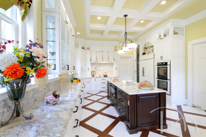
This century home in University City had been updated throughout by the new owners, except for the kitchen. Our task? Create a state-of-the-art kitchen that was true to the home’s history. Removing a hideous drop ceiling revealed a soaring 14-foot tall space uninterrupted by HVAC, plumbing or electric—leaving ample room for custom clerestory cabinets and a breathtaking coffered ceiling. A custom porcelain floor mimics marble and wood, mirroring the contrast of light and dark in the cabinetry. The long-awaited new kitchen even includes a butler’s pantry and powder room, utilizing the space from an adjacent hallway.
See more of this kitchen here
Design by Marcia Moore | Photo by Michael Jacob
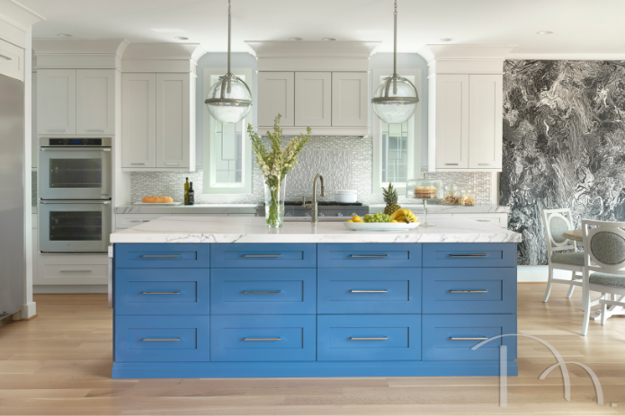
In this new home, we combined comfort and function with thoughtful design choices to create a truly personalized home with numerous custom details and features. The striking kitchen design features a neutral black and white palette is energized with pops of color, including a beautiful blue island. Custom cabinetry creates extra storage options, and the clients’ extensive collection of wall art and decorative glass are expertly woven into the home’s award-winning design.
See more of this home here
Design by Marcia Moore | Photo by Alise O’Brien
THE LIVING/HEARTH ROOM
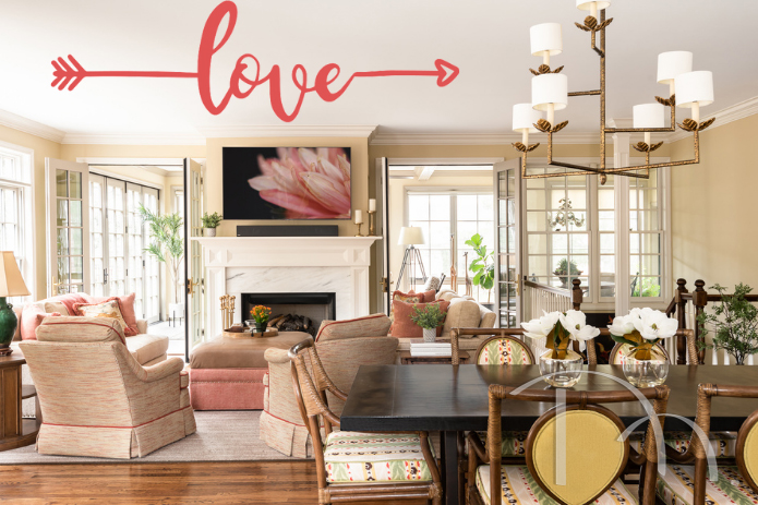
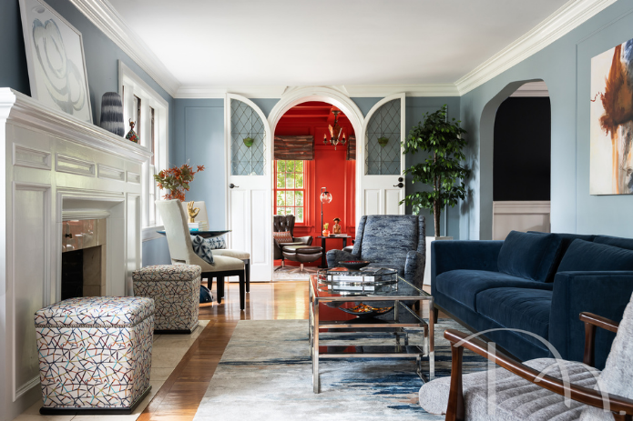
This client wanted to bring a contemporary vibe to their very traditional living room. We loved the bones of this classic room, so we added a more modern color palette and chose transitional furnishings that could live happily in this blended space.
Design by Kathleen Matthews | Photo by Karen Palmer
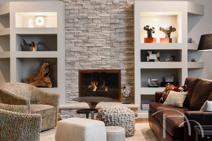
This hearth room is a great example of designing a space specifically for a family’s unique needs. Our clients wanted this space to serve multiple purposes. The room needed to be a place to gather with family and friends, but also be a welcoming spot to do homework, enjoy a cocktail or bite to eat by the fire, watch TV or just chill. Our solutions? Use multiple small tables (for homework and eating), add comfy ottomans in the middle (for extra seating and putting your feet up) and choose swivel chairs which can face the sofa or the TV. A new fireplace surround of textured ledge stone also creates a dramatic focal point.
See more of this home here
Design by Marcia Moore | Photo by Karen Palmer
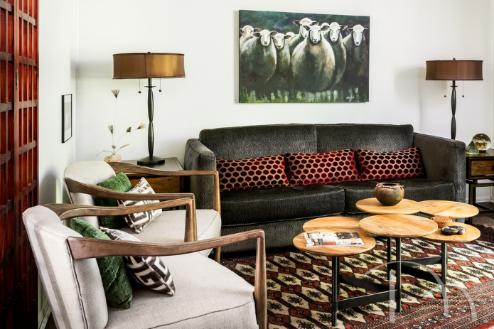
I especially love this living room because, well…it’s mine! I live in rental townhome, so I’m somewhat limited on what I can do, but I’m pretty happy with what I created in this space. The living area is just the right size for entertaining guests before dinner or lounging after work. I anchored the space with a gorgeous, plush, hand-knotted Bokhara rug, angled on top of a wool rug. To add a touch of elegance, I had my Hollywood Regency Style sofa upholstered in dark brown embossed velvet. A whimsical painting of sheep by local artist Nancy Berndt keeps the space from getting too serious.
See the rest of my townhome here
Design by Marcia Moore | Photo by Karen Palmer
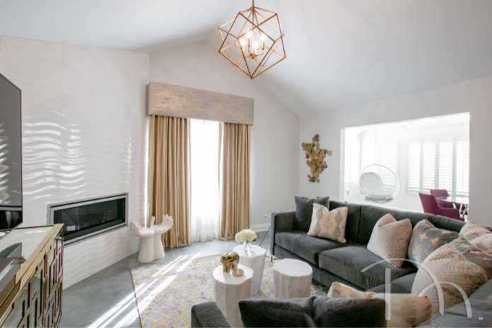
This living room got a pretty great glow up transforming it from a typical suburban condo to an all out glamorous home. The fireplace is a focal point with its glossy wavy white tile. A stunning mirrored console, a trio of gold chandeliers (you can only see one here), a sink-in-soft but tailored sofa and fun accessories, like the hand stool, make this redo remarkable.
See the rest of this home here
Design by Marcia Moore | Photo by Suzy Gorman
THE BEDROOM
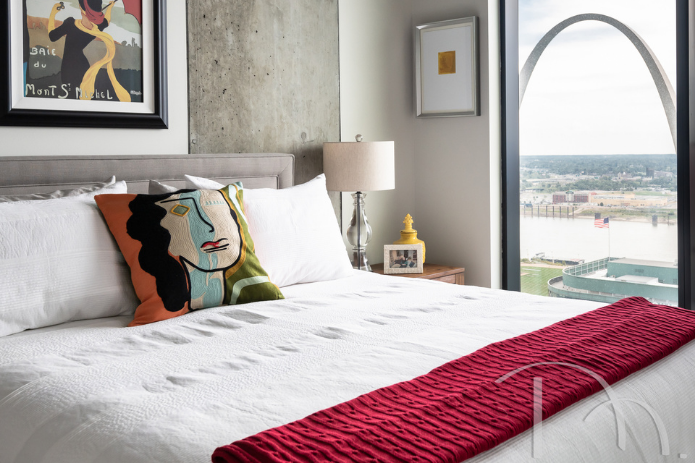
Designed as a getaway for our clients, this Ballpark Village high rise apartment home marries an industrial look with thoughtful choices that soften its edges. The primary bedroom is a perfect example. Designer Kathleen Matthews took a neutral palette and gave it a bold pop with red accessories and art. Space planning was key, but Kathleen was able to find room for a queen-size bed, two nightstands and a dresser. Of course the spectacular view of the St. Louis arch was a nice finishing touch.
Read more about this high rise apartment home here
Design by Kathleen Matthews | Photo by Karen Palmer
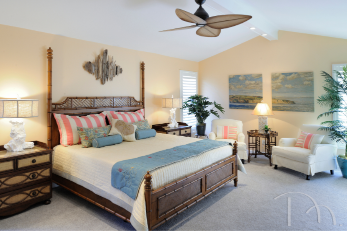
This primary bedroom is part of a coastal home design for clients who live in Missouri but who love the Florida Keys. We painted the room in “Flan” (#6652), a restful ivory hue by Sherwin-Williams and added an artful blend of tropical hues, West Indies-inspired furnishings and beachy accents, with a stunning bamboo bed as the focal point. Custom touches include a creamy coverlet and handmade decorative bed runner embroidered with hibiscus. How cool are the white bedside table lamps crafted from a driftwood mold?!
Read more about this coastal reno here
Design by Marcia Moore | Photo by Michael Jacob
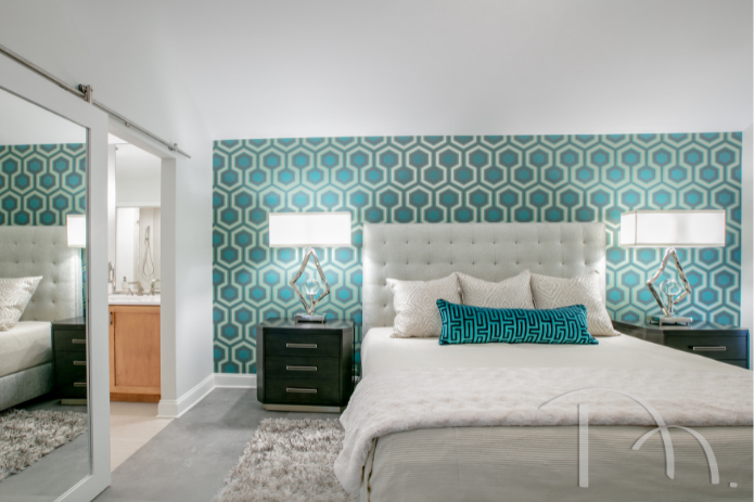
For this primary bedroom, we were asked to combine the wife’s penchant for glamour with her husband’s more tailored vibe. The striking geometric blue wallpaper adds punch, and is an ideal accent wall behind the classic upholstered headboard. The diamond shape on the lamp is repeated in the sham fabric. And the opposing textures, including velvet, silk, nubby tweed on the headboard, wood, sleek chrome, fabric and wallpaper combine to create a harmonious and restful space…and a happy couple.
See more of this glam redo here
Design by Marcia Moore | Photo by Suzy Gorman
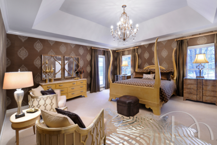
Challenged by our clients to add personality and drama to their suburban home, we transformed typical spaces into delightful spaces with a “wow” factor. The primary bedroom design melds Hollywood glam, Art Deco influences and just a touch of Moroccan flair to create one-of-a-kind style.
See more of this home here
Design by Marcia Moore | Photo by Michael Jacob
THE BATHROOM
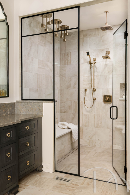
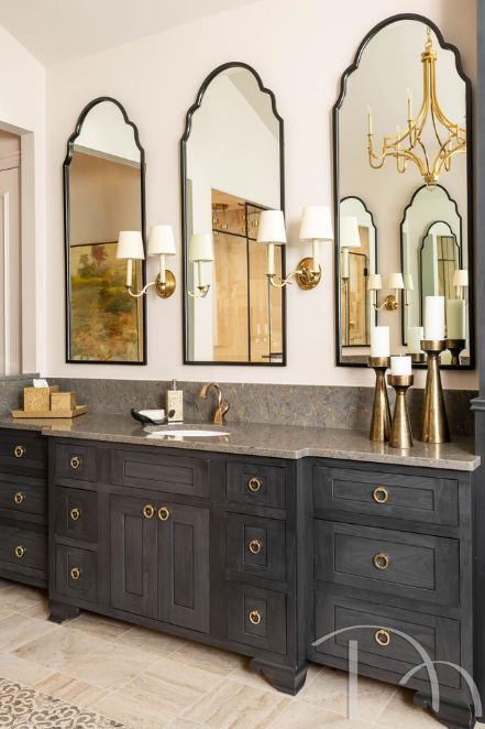
My clients loved the traditional bones of the home but longed for a luxurious spa bathroom experience. The original bath was spacious but nothing special and had an awkward layout. A new layout separates the toilet room from the main bathroom and includes a stunning freestanding tub, two separate vanities and three striking arched mirrors on top of each.
We also doubled the storage space and added an inlaid decorative tile rug between the vanities, more reminiscent of a Roman bath than a 21st century home. The shower was enlarged and enhanced for the ultimate bathing room. Three rain shower units, with a total of nine nozzles were added above a long bench to be used for restoring aching muscles. How much more spa-like can you get?
Design by Marcia Moore | Photo by Karen Palmer
Design by Marcia Moore | Photo by Karen Palmer
Originally built as a separate self-contained sink area with a second door leading into a full bathroom, this room had lots of wasted space. By removing the wall, we created a spacious contemporary bath with a minimalist, spa-like feel using sleek, light wood cabinetry and contemporary lighting. A custom glass mosaic tile backsplash installed vertically to resemble a city skyline is a creative custom feature. Notice the enormous moon (mirror) over the skyline. From crowded to expansive, dated to delightful, this bathroom remodel is one of our favorites.
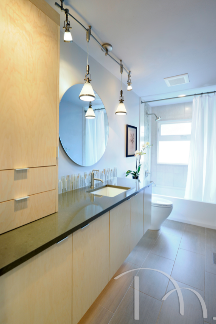
Design by Marcia Moore | Photo by Michael Jacob
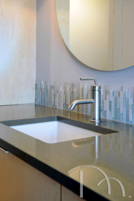
Design by Marcia Moore | Photo by Michael Jacob
(left): For this powder room, we loved the black and white mosaic floor tile so much, that we decided to take it up the wall behind the vanity. Unexpected and bold, this is an example of a design decision that made an impactful style statement.
See more of this home here
(right): This award-winning powder room is one of our favorites. Dark and moody, the wallpaper here wraps this space in drama. The vessel sink and stunning light fixture really brought this whole space together.
See more of this home here
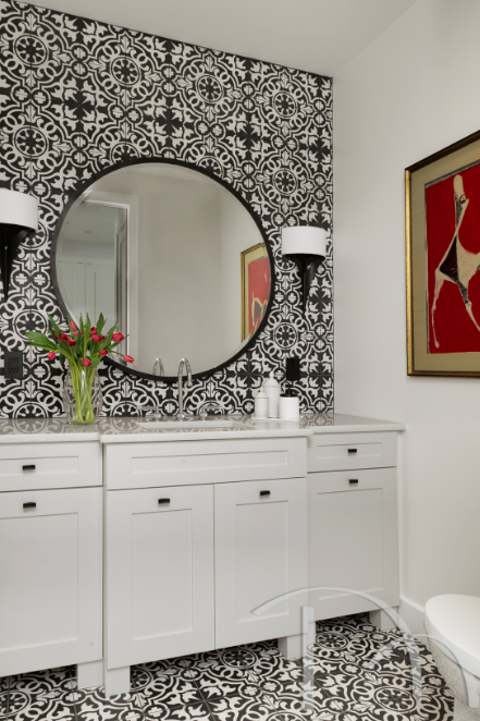
Design by Marcia Moore | Photo by Alise O’Brien
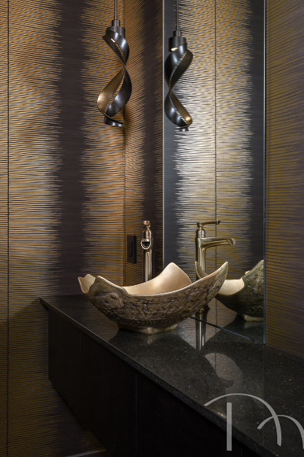
Design by Marcia Moore | Photo by Karen Palmer
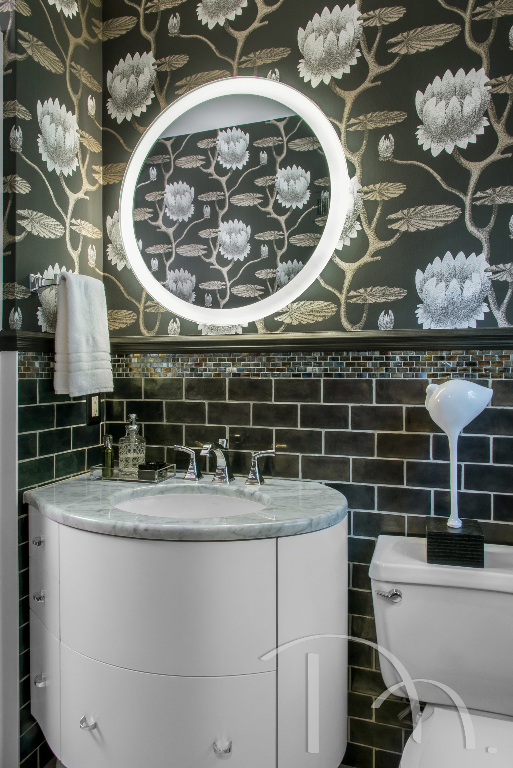
(left): A small powder room is a perfect place to think big! To set the glamorous tone our clients envisioned for this space, we wrapped the room in a large scale black and white floral wallpaper. Layering iridescent black subway tiles topped by iridescent mosaics and a chair rail in iridescent black paint add flair and protect the wall from water splashes. A curved vanity keeps the space from feeling crowded, and a round mirror with edge lighting eliminates the need for additional sconces, which would have felt cluttered on the dramatic wallpaper.
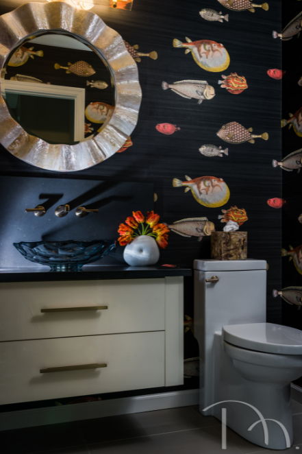
(right): This whimsical wallpaper was an ideal choice for the powder room in our client’s tropical themed home. We love the wavy circular mirror and the vessel sink. The rest of the home was done in soothing beachy tones, so this was a welcome and fun departure.
See more of this home here
Design by Marcia Moore | Photo by Anne Matheis
Design by Marcia Moore | Photo by Karen Palmer
There are so many ways that we can help you fall in love with your home. What are some of the items on your design wish list? Give us call at 314.395.1114 or send us an email, and let’s get started!
Until next time,

P.S. Be sure to check out our portfolio to see more of our work!


