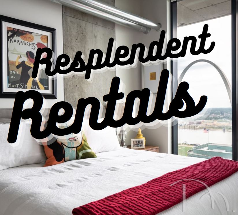
We often idealize the ultimate creative freedom and status symbol of home ownership, but the truth is that rentals can wow, if you know how to work with them. Rentals may conjure visions of college kids and hand-me-down furniture, and that’s certainly a part of the story. But rentals can also serve as getaway vacation homes, respites from the burden of home ownership, and great options for downsizing. I myself rent a townhome, and I love the freedom that comes with not being on the hook for repairs and maintenance or yardwork! I know renters in their thirties and renters in their sixties, couples, families, and singles. Renting really can be a great option, and I say we embrace the constraints and make the best of them! Read on to check out some of the rental projects we’ve done, and you’ll see that with a little creative problem solving and clever workarounds, rentals can feel just as comfortable and customized as owned homes.
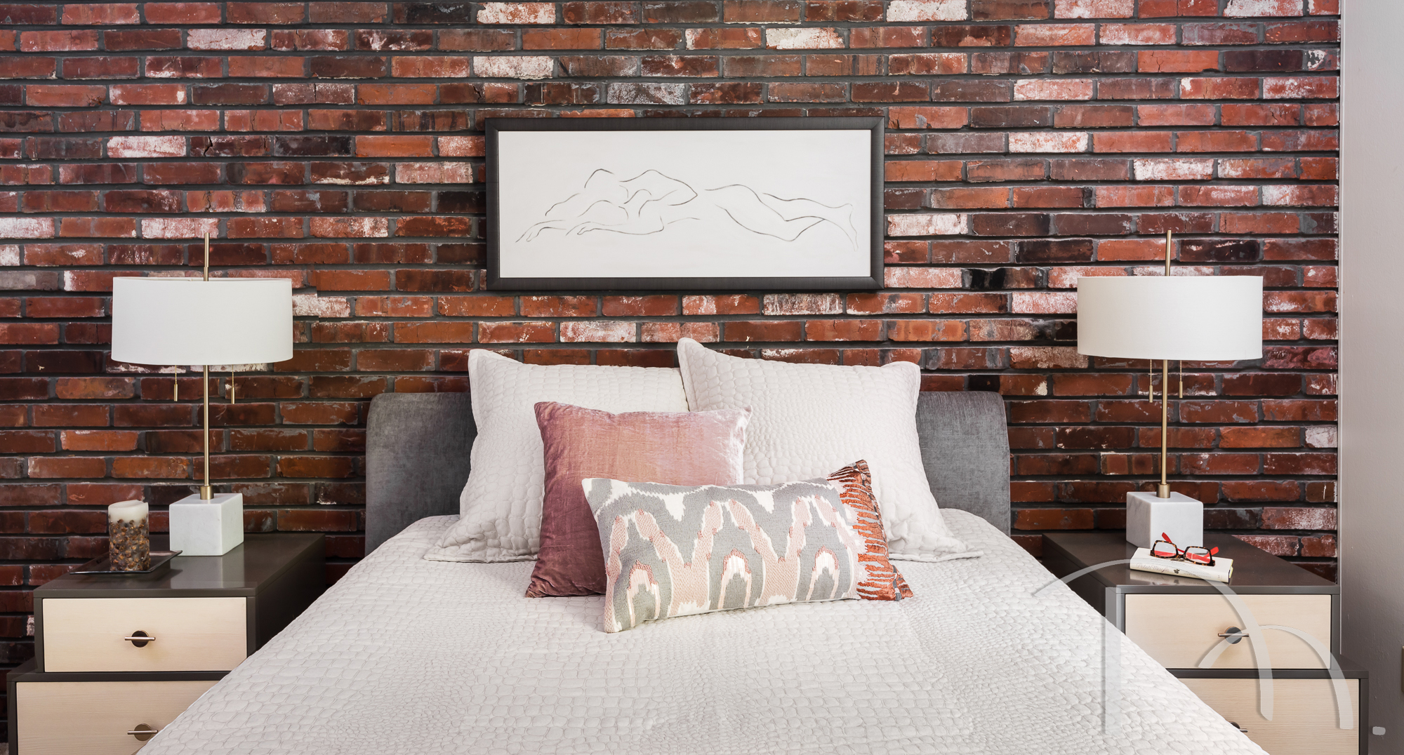
One thing that can sometimes create an obstacle is an unconventional wall material. In the case of this bedroom, the brick wall was there to stay and couldn’t be painted. My solution? Coordinate with the warm earthy tones of the brick and embrace the browns and reds. I highlighted the pops of white in the brick with white lamps, bedding, and art.
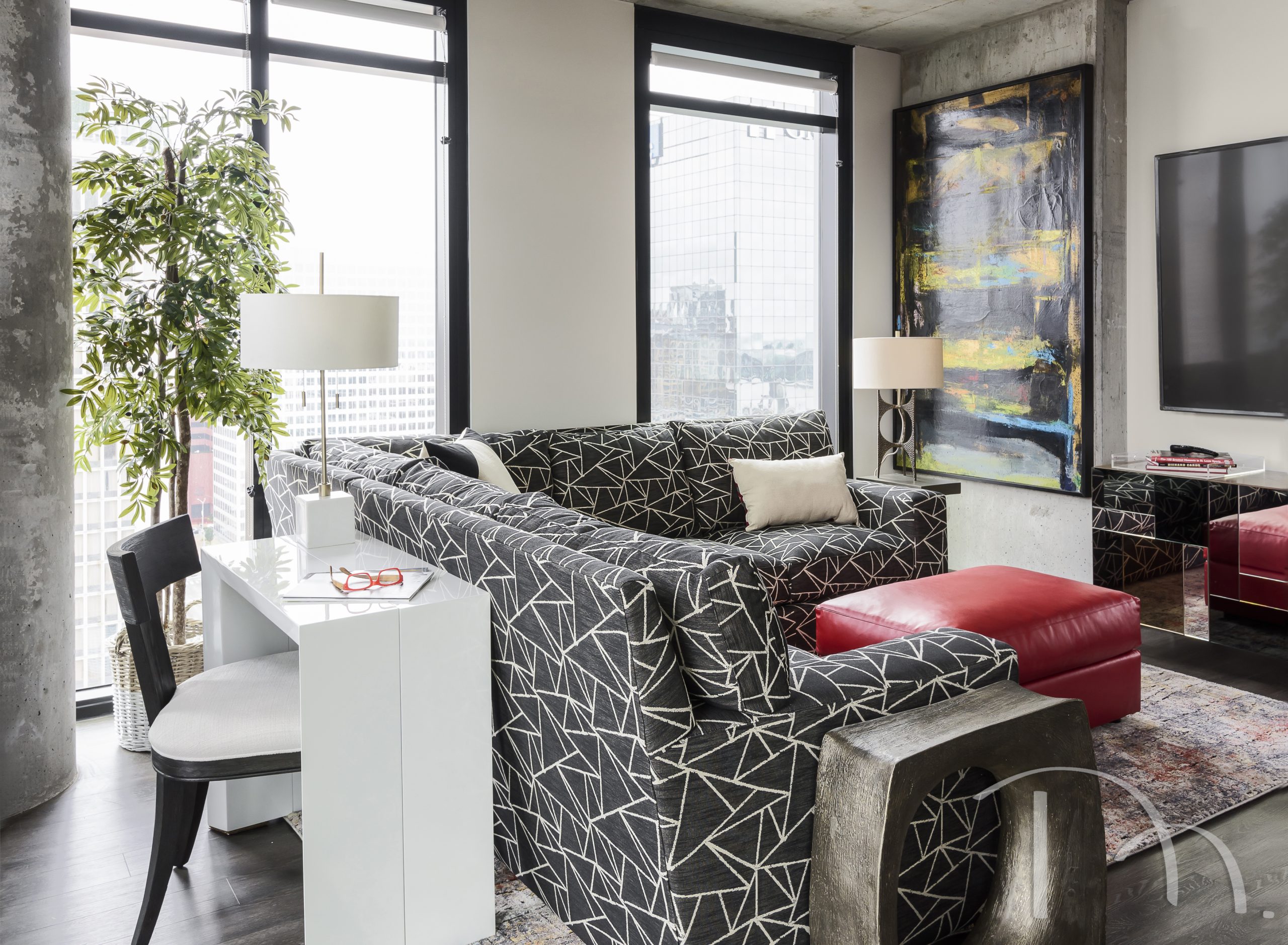
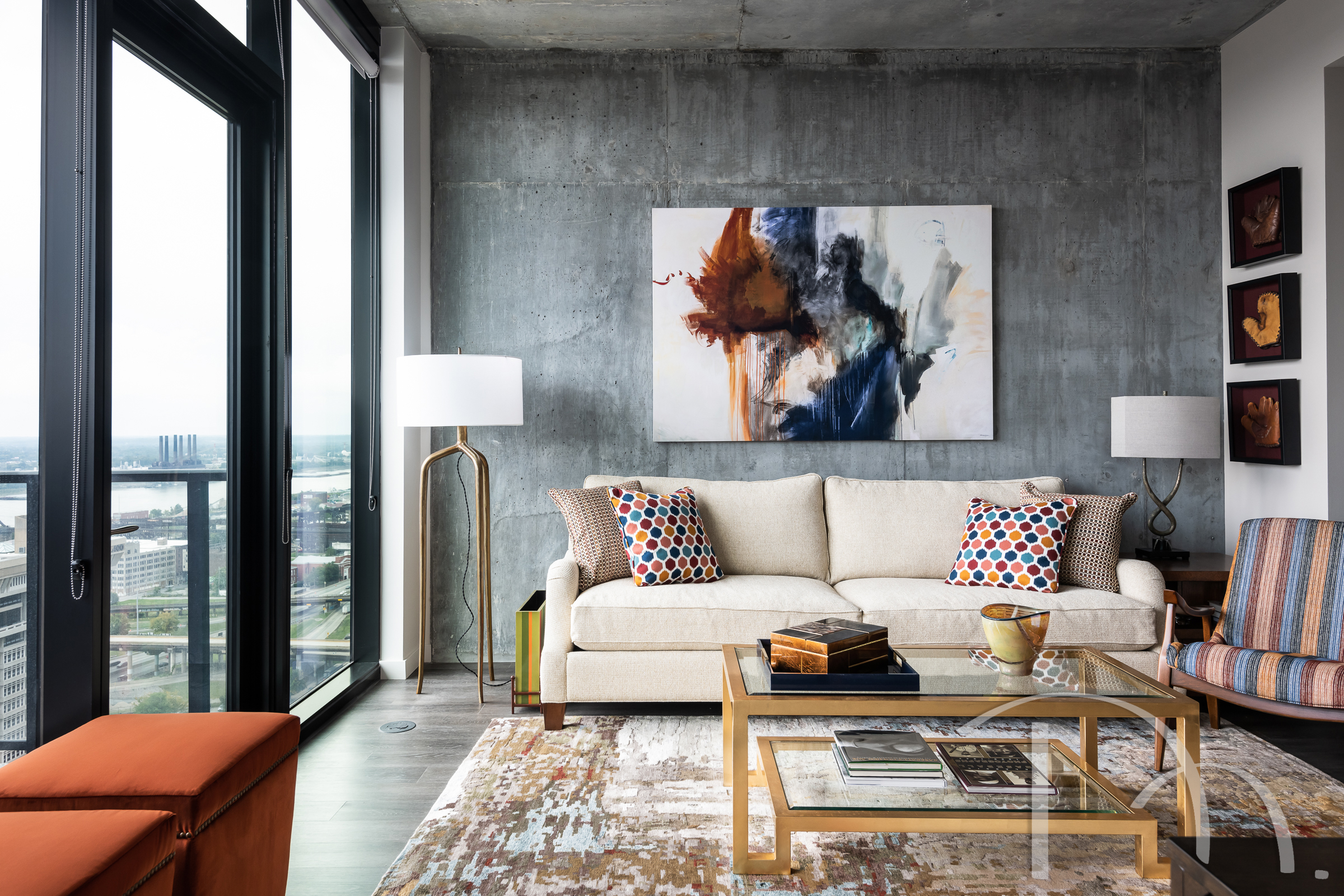
Concrete walls are another challenging feature. They add a great industrial texture, but they’re not exactly nail-friendly. We had our hanging experts install these pieces of art on concrete walls with zero drilling. The trick? An industrial-strength tape.
Another common rental plight is the outdated/ugly/sad light fixture. Just remember to keep your old fixture around so that you can rehang it if you end up moving. That way you’ll be able to take your upgraded fixture with you. This dining room in my rental townhouse used to have a ceiling fan. I personally cannot abide a ceiling fan in a dining room – the thought of a dust-garnished dinner just grosses me out. Plus, having it on would cool your food too quickly. This stunning fixture not only enhances the look of the room, it provides great light and is dimmable for evening ambiance. (To avoid any issues or liability, please have a licensed electrician install lighting, always!)
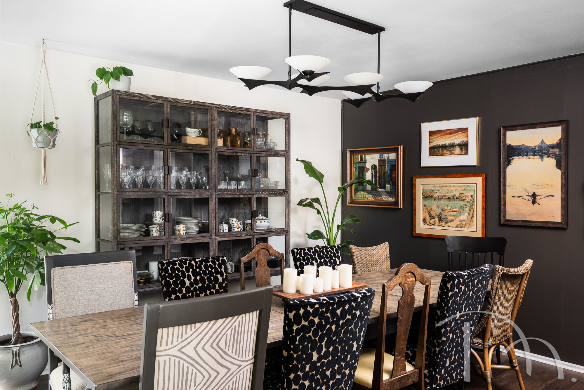
The other way I chose to make my dining space more interesting was through the addition of an accent wall. Rentals are often completely white, and some people love that! I wanted to add a pop of interest, so I chose to paint one accent wall and create a gallery wall of art. The nice thing about an accent wall is that when it comes time to repaint, I have one wall to repaint instead of three or four. I get the added interest with less work.
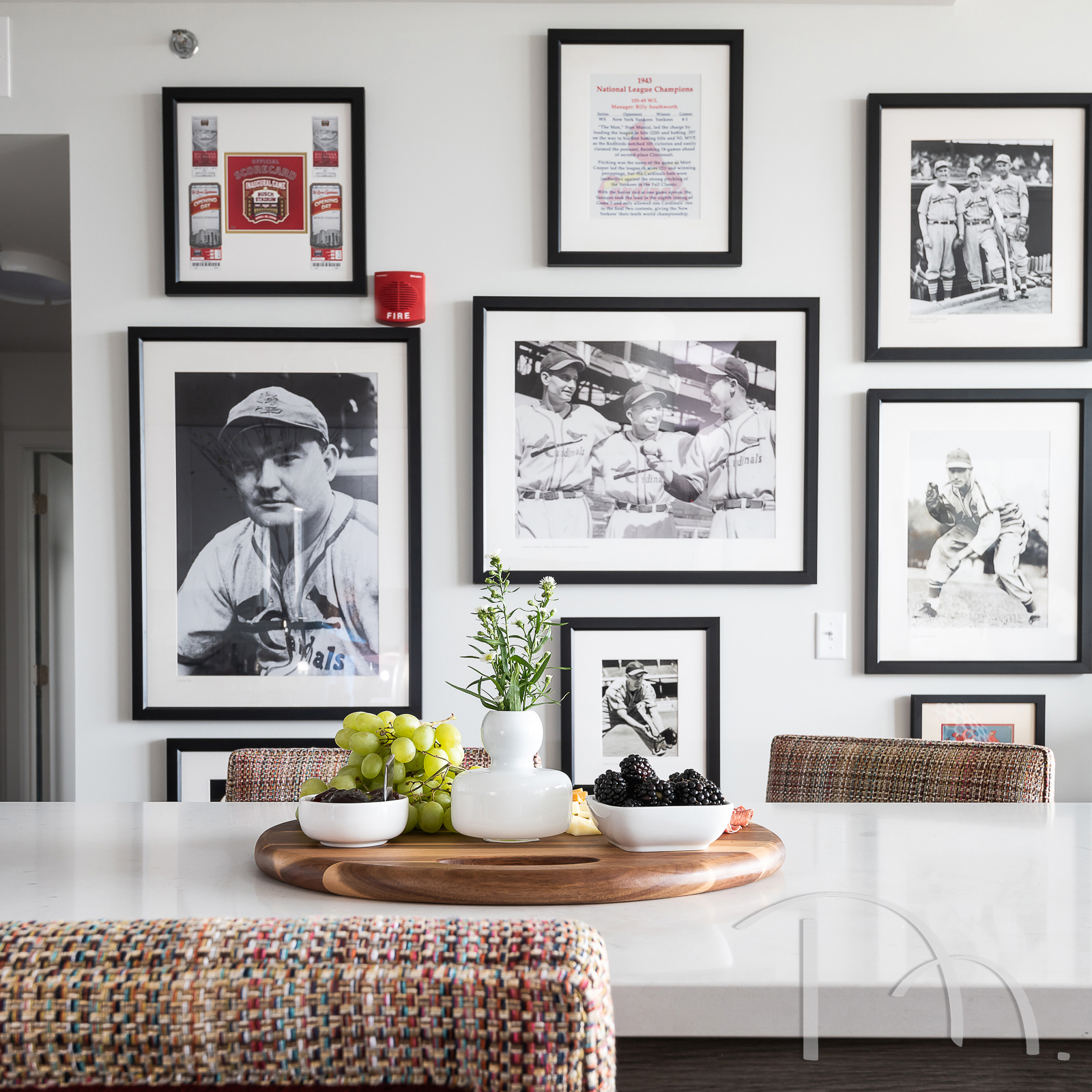
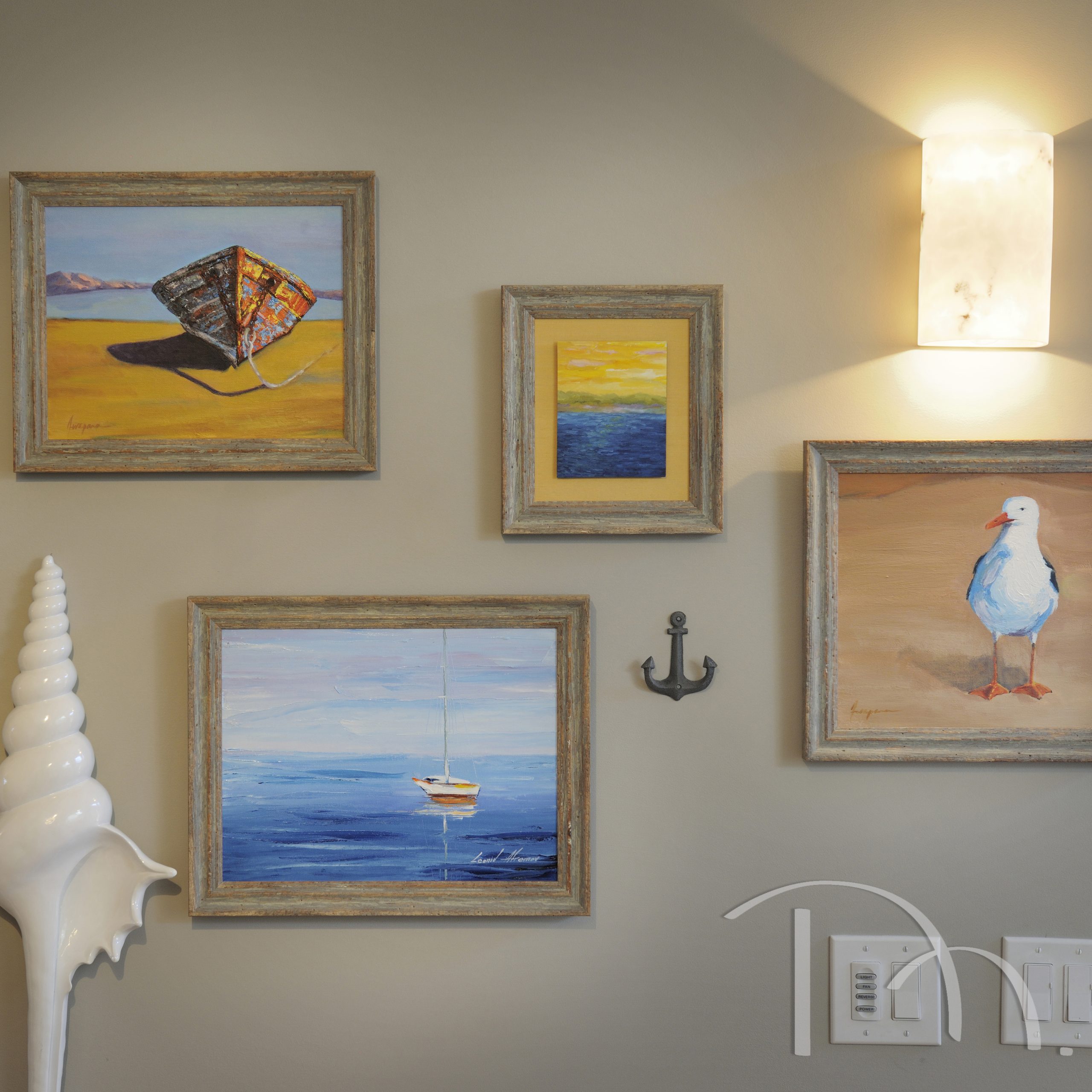
While we love gallery walls simply for the visual interest they add, I have to say that they’re just as useful when it comes to making utilitarian eyesores a little more tolerable. Light switches, fire alarms, and sprinkler systems (more common in industrial loft-style rentals) can all blend in a little better with the help of a well-composed gallery wall.
One thing that can almost never be changed in a rental is the floor. This is where our tried-and true favorite, the area rug, comes in. It can cozy up a cold concrete or ugly vinyl floor, or jazz up cheap carpet. Bonus – your rental carpet is less likely to get damaged (and we renters want the best chance of getting our deposits back) when it’s partially covered with an area rug.
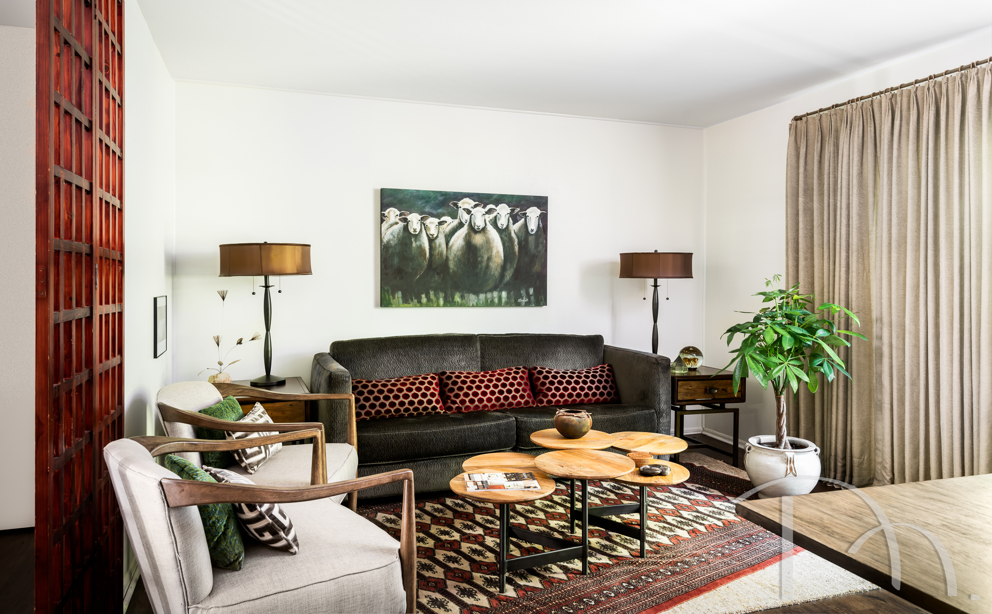
One of the best choices I made for my rental was to remove the vertical blinds and replace them with drapes and sheers. It feels so much cozier and more welcoming, and I can rehang the vertical blinds when I leave.
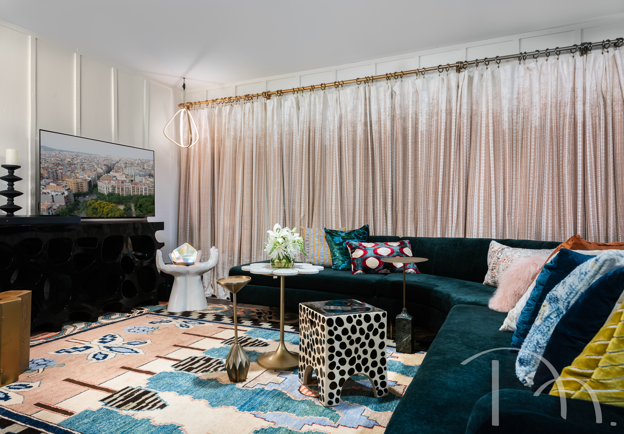
I also love how my drapes helped me turn this lower-level space into a home theater room. They block out the light and provide me with privacy, but I can always open them up when I’m ready for sun.
Let’s talk furnishings! Rentals are not the place to install custom built–in bookcases, but you can certainly opt for beautiful pieces that can follow you wherever you go.
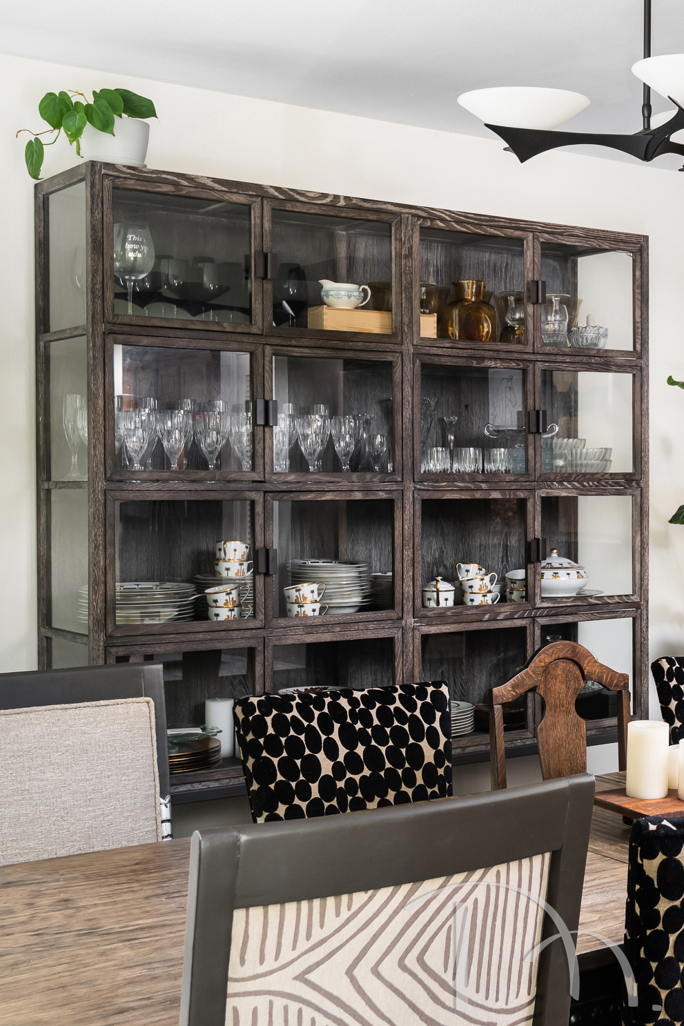
I was bound and determined to get my China cabinet into my dining room. The movers had to remove the front door and the stair railing, but we got it in! One inch larger, and it wouldn’t have made it. So while I encourage creative furnishing freedom… I’ll also highly encourage measuring and appropriately selecting for the space.
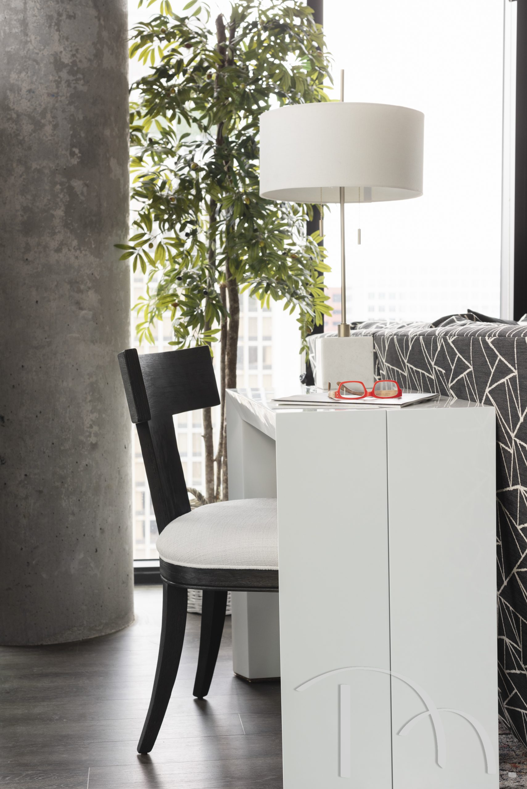
When you’ve got a smaller rental on your hands, consider using clever furnishings that save space and can adapt to meet your needs. This desk can expand if the client wants a larger table, but for everyday use it works perfectly for the small space.
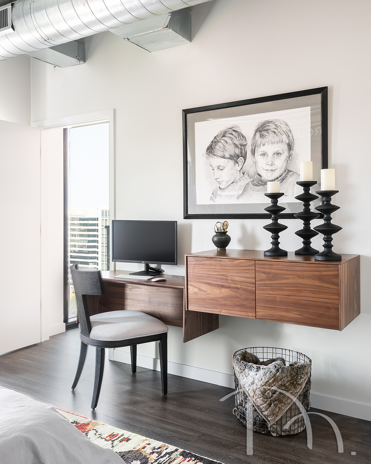
We used this great little wall mounted desk to create the perfect little office nook in a space that would have otherwise gone unused.
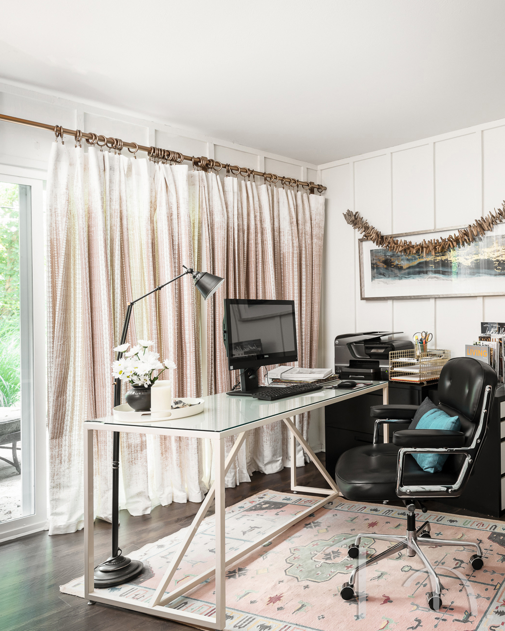
I carved out an office space for myself behind my theater room. The open, minimal design of the desk keeps the space feeling open. Bonus: it allows that fabulous rug to shine!
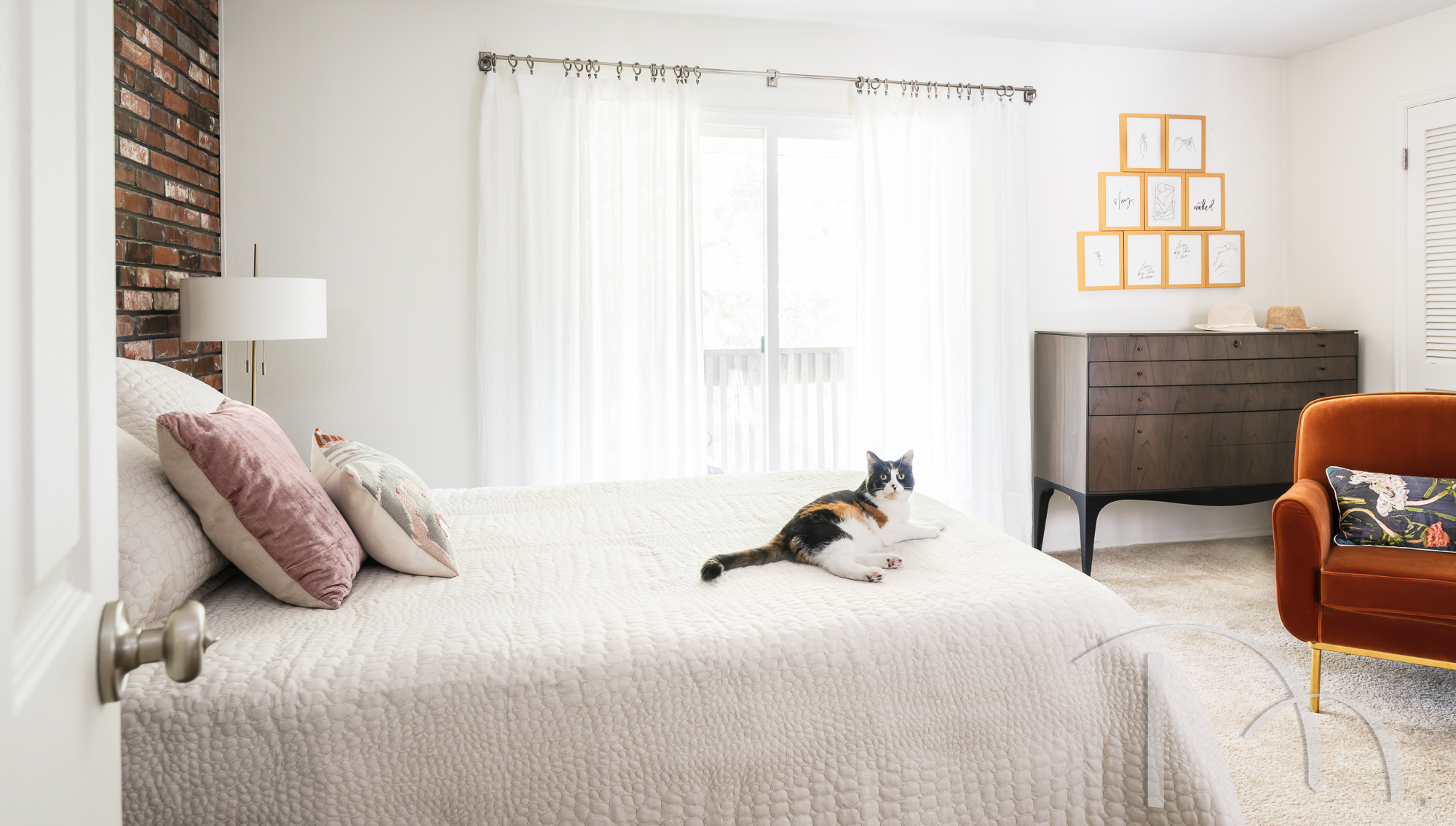
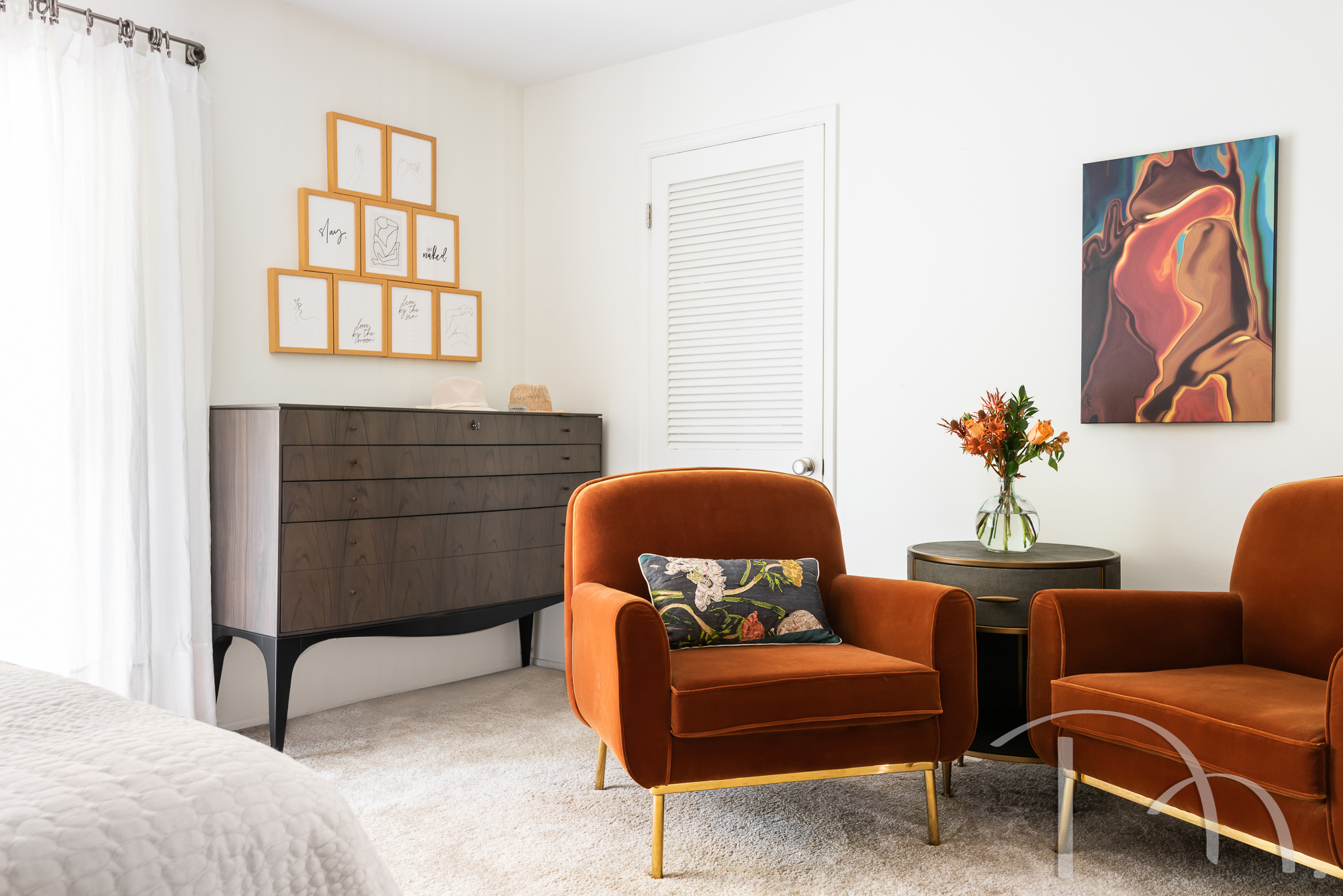
The other benefit of great furniture is that it can distract from less-than-perfect rental features that can’t be changed. I love how my pretty chairs and dresser pull my eye away from the closet doors and carpeting (neither of which would have been my first choice).
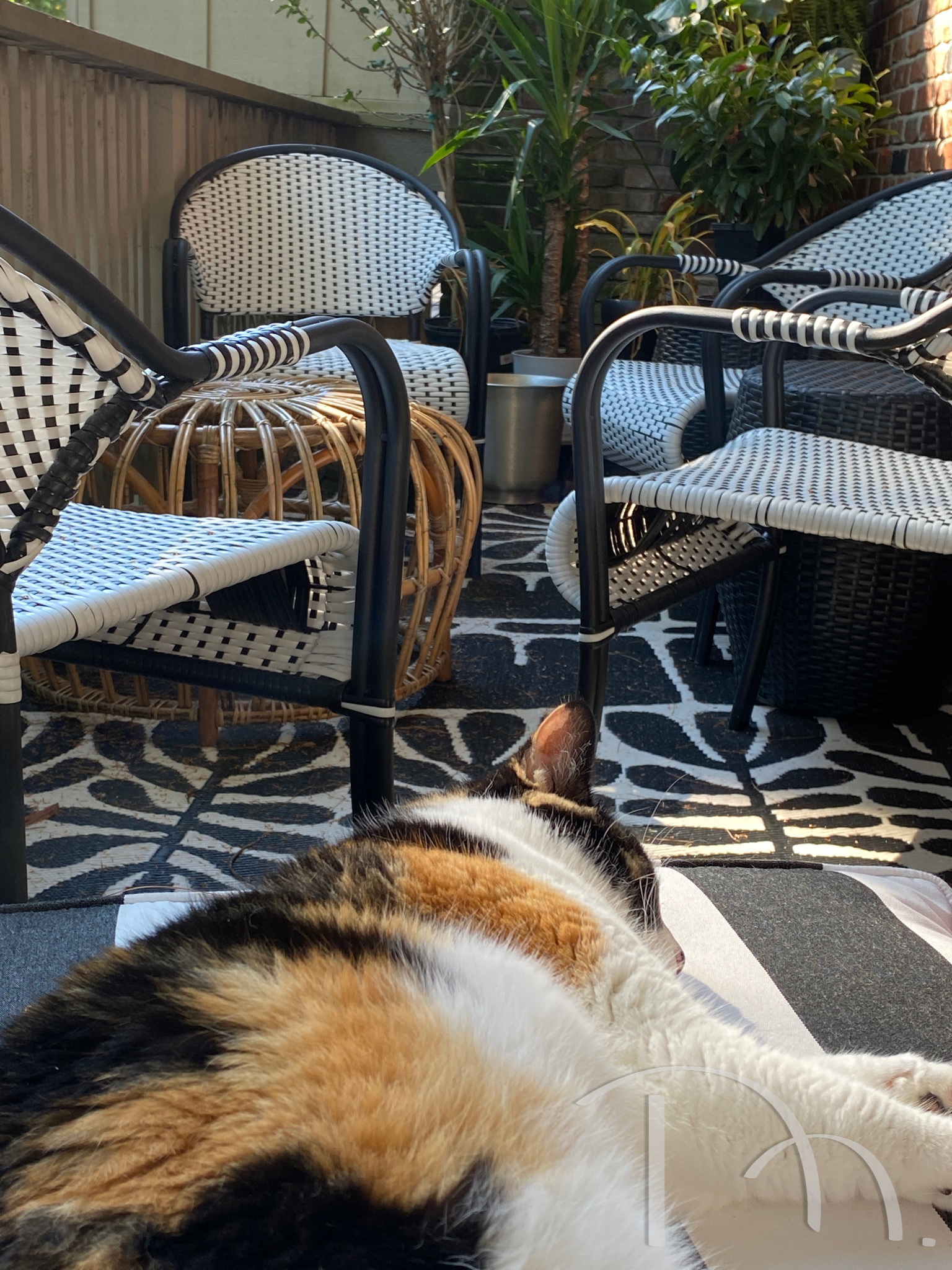
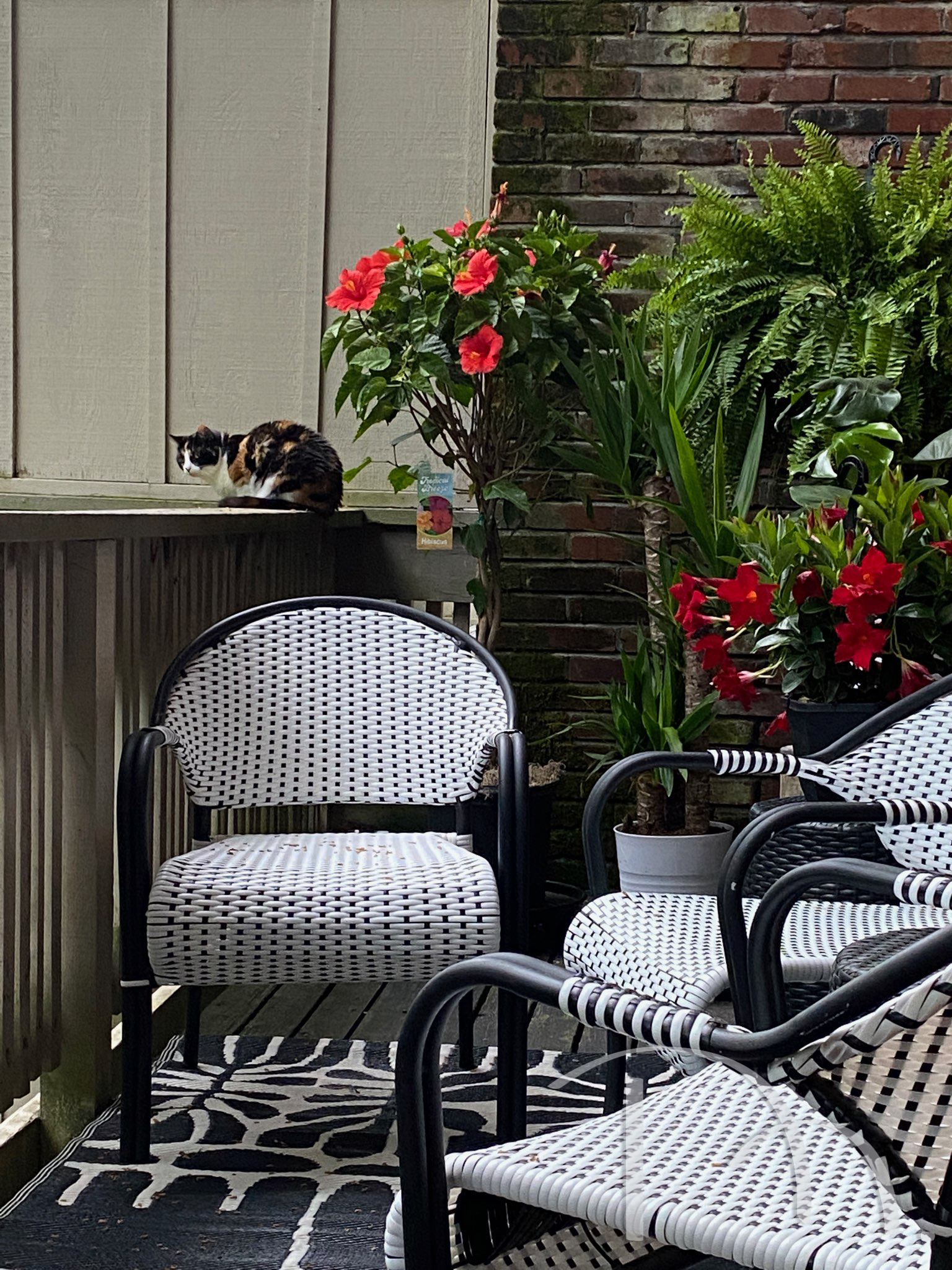
Lots of rentals come with balconies. You might not get the square footage of a traditional deck or yard, but that doesn’t mean you can’t use fun furnishings! I furnished my small balcony and I have to say, it’s more than enough to meet my (and more importantly, Isabel’s) needs.
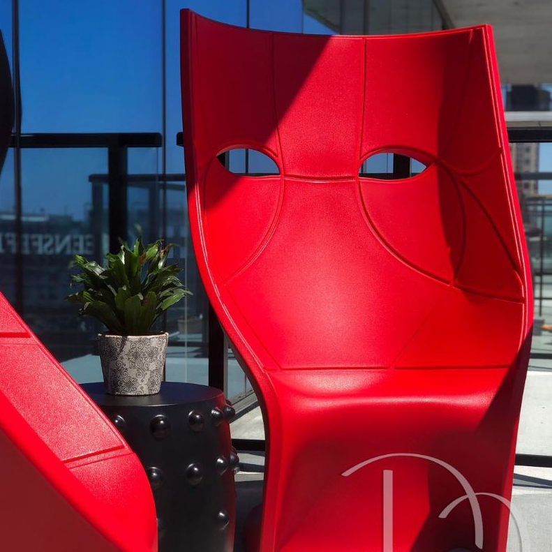
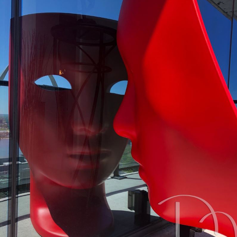
I love these chairs that our clients chose for their balcony. They’re so full of character, and it really makes the space feel like an intentional part of the whole, rather than an afterthought.
I hope this helped you realize that rentals can be so much fun! But everything I showed here also translates just as well into a home that you own. Thanks for reading, and be sure to reach out if you’re looking for a little TLC in your own rental space! Until next time!


