I’m Chelsea Wilkins, Marcia’s design assistant. Marcia and I thought it would be fun if both of us offered our takes on the 2023 Color of the Year announcements. Pull up a chair and join us!
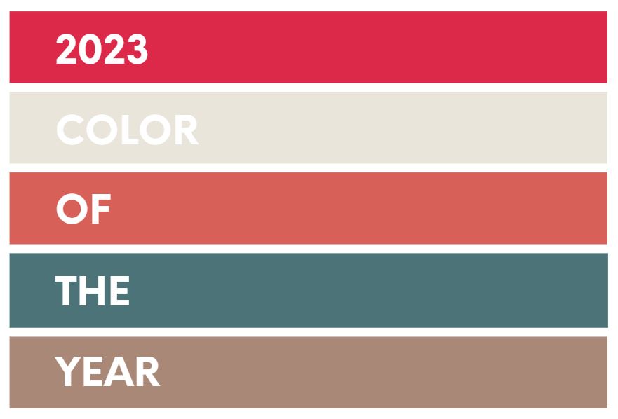
Chelsea: I love checking out the color of the year predictions from paint manufacturers and design sources. To me, it’s like watching the Grammys (congrats, Harry) or the Oscars – it’s a fun way to get a pulse on what’s happening. More than that, I love comparing predictions to my own opinions and observations, and dishing with the precious interiors enthusiasts in my life who understand that paint color trend predictions are very much worth lengthy debates. Let’s dive in and see what people are saying.
Marcia: Don’t forget Beyonce breaking that barrier! Way to go Bey!
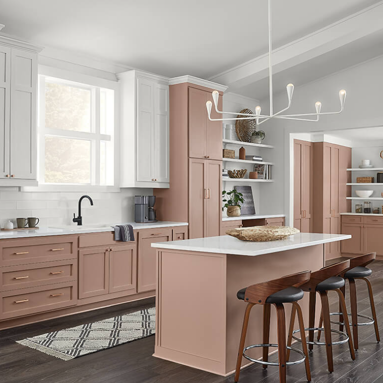
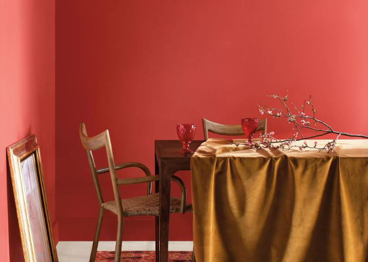
Sherwin Williams: Redend Point
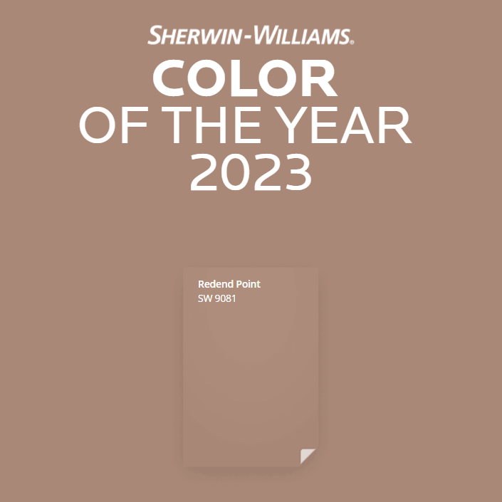
Chelsea: This one’s a mauve-y, earthy color not unlike the terra cottas we saw everywhere…last year. Don’t get me wrong, earth tones and nature-inspired textures are still huge – I just don’t think it’s taking the world by storm this year the same way it did over the last year or two.
Marcia: I love that this color is halfway between terra cotta and pink. If you love both of those recently trending colors, as I do, but find them a little too harsh, then this is the color for you! Soft and soothing, Redend Point.
Benjamin Moore: Raspberry Blush
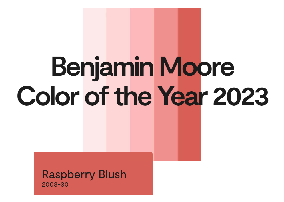
Chelsea: I find Ben Moore’s pick much more exciting, I have to say (sorry, Sherwin). Raspberry Blush still feels natural and approachable, but it’s zesty and a little more unexpected. Will it be everywhere this year? I’m not so sure on this one. I’m seeing pink allllll over, but not with this much red.
Marcia: The entire red family is my favorite pallet so I’m always happy when they make the COTY list. Raspberry Blush is pure fun and just a little more exciting and sassy than pink in my opinion. Be bold with Raspberry Blush.
Pantone: Viva Magenta
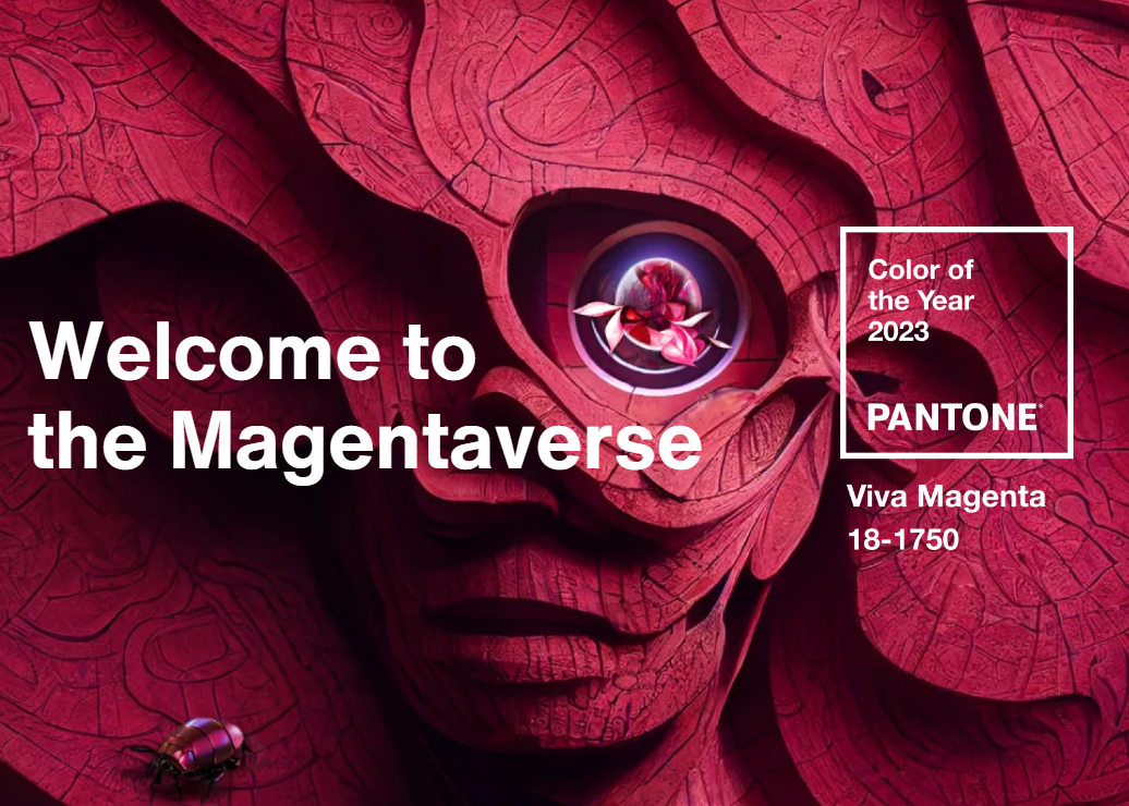
Chelsea: Yet another red-based selection! While Pantone isn’t quite as interior-specific as paint manufacturers, I see them as the authority on color trend – across industries. I have seen this color everywhere this year. Fuchsia and magenta are popping up all over the place, but I’ve noticed a huge surge in the fashion industry. Will it take over the décor industry? I’m not so sure. I’ve seen punchy pink linens and accessories, but it’s hard to beat out neutrals when it comes to décor popularity.
Marcia: I love, love, love Viva Magenta. While Raspberry Blush is fun and sassy, Viva Magenta is her upscale cousin. More refined, classy and with such a rich depth to it, I can see lots of uses for it. I once had all the cabinets in my kitchen done in a color similar to this, with white marble countertops – I’d recreate that in a heartbeat!
Behr: Blank Canvas
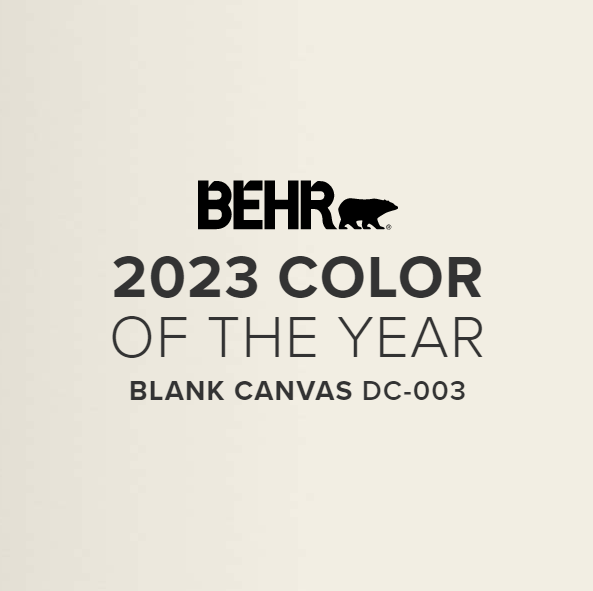
Chelsea: Speaking of neutrals, Behr’s not taking any big risks with their 2023 color. Does that make it less appealing? I don’t think so at all! The name has a great vibe that feels fresh, clean, and inspiring. The color itself might not be exciting, but that doesn’t mean it isn’t pleasing. People love neutrals and always will, because they make a great -ahem- canvas for layering pops of color that can easily be switched out as tastes change.
Marcia: This neutral makes me very happy for 2 reasons. Firstly, it isn’t gray! We are finally breaking from sterile grays and moving towards warmer tones. While this color has gray undertones, it also has warm yellow in it, making it a lovely backdrop to almost any room. Secondly, it makes me feel at peace when I look at it. If you want serenity in a room, this is the perfect wall color.
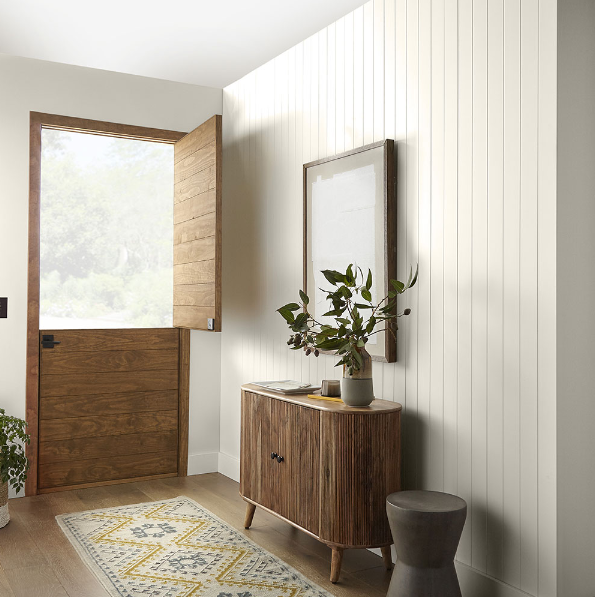
PPG/Glidden: Vining Ivy
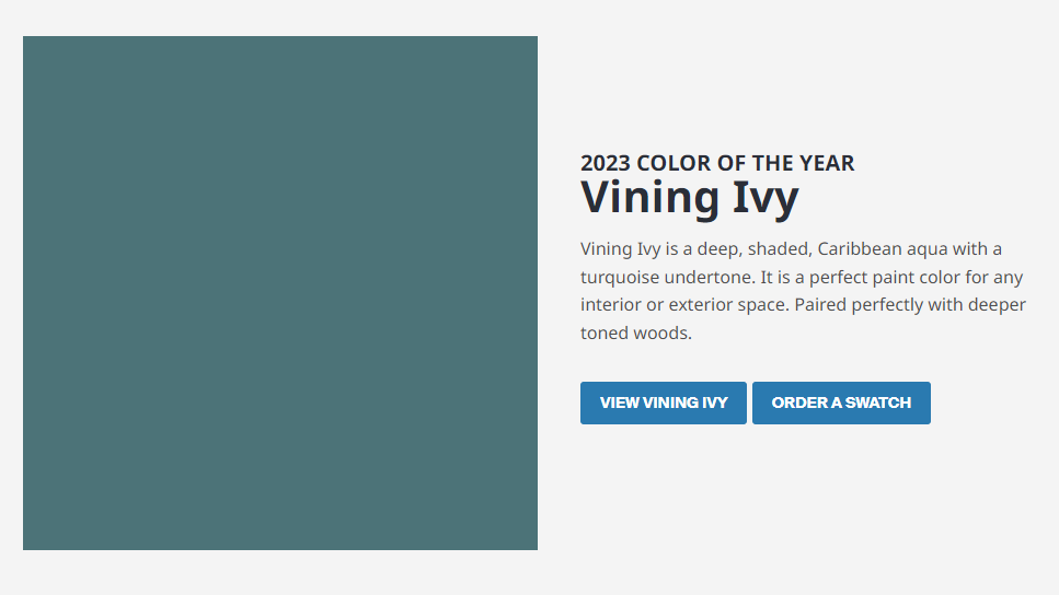
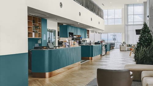
Chelsea: I have to give PPG an appreciative nod for giving us the only cool-toned color of the bunch. It’s pretty, it’s soothing, and it blends really well with neutrals and earthy textures. But again, like the SW pick, I saw this one everywhere (especially in clothing) last year! It’s still popular, it’s still beautiful, and jewel tones are always in style. I just don’t see it as up-and-coming.
Marcia: I personally love the blue-green tones, finding them to be much more interesting and soothing than plain blue or plain green. This is the best of both worlds and a great interior color for those of you wanting to work with blues or greens. It will make a strong statement on a wall, creating a cocoon of color for all your neutral furniture.
Recap
Marcia: Rarely do I like every color of the year but this year I do! I can see using every one of these colors in my projects. It will be fun to see which one has the most staying power. This coming December we will do a recap on how each of these colors fared over the year. Make sure to stop in again to find out which one takes top honors!
Chelsea: I agree with Marcia – these colors are all fabulous! I think Viva Magenta is going to be the star of 2023, but only time will tell. I’d use any one of these colors myself. Thanks for joining us, and let us know what you think about these colors!

Love hearing what we have to say about the latest in interior design? Be sure to sign up for our emails! We cover all things design and deliver exclusive tidbits to your inbox a few times a month.
P.S. Check out our portfolio to see more of our work!
P.P.S. Want to know more about kitchen and bath design? Click here.
P.P.P.S. Want to know more about custom home design? Click here.