Photo by Karen Palmer
A few years back, I was a soon-to-be empty nester, single and extremely busy running my interior design business. The big house that I loved, with a gorgeous and enormous garden, suddenly seemed to be a huge burden. So I sold the house, took the leap and down-sized to a rental townhouse. Big change! Want to hear about the journey and see what I did? Read on!
First good decision – choose wisely. I love being close to the city, but with the space and amenities of the suburbs. I also didn’t want to spend the time and money to maintain my own residence anymore. Being a small business owner took all my time! I also had no desire to maintain a large outdoor living space and gardens, but I truly love being outside and knew I needed to have lots of access to the outdoors. I have always thought I would enjoy townhouse living because I like multiple stories and I wouldn’t have anyone above or below me. I found a townhouse in a suburb flanking I-270, in a secluded area with a wooded, private backyard. I have close to 1500 sq. ft. of indoor living space, plus a patio and 3 (yes, 3) decks! No matter where the sun is (or isn’t) I have an outdoor space to enjoy. I can watch the birds and the deer in my back yard, see the trees start to sway as a storm rolls in, but be totally secure in my 3-story living space.
First “get over it” decision – not everything will be perfect in a rental. This was a big hurdle for me, an interior designer, who was used to living in a completely remodeled home with beautifully updated kitchen and baths, and furniture that perfectly suited my style and my home. I moved to an older apartment community with the kind of bathrooms and kitchen you expect in an older apartment. Functional, yes. Attractive and updated, not! I had to settle for adding some creative décor to these spaces and calling it a day.
The living spaces, however, were a different story! I ripped up cheap, ugly, nasty carpet and paid extra to have attractive luxury vinyl plank flooring put in. What a huge difference that made in the living room, dining room and lower-level family room. All of a sudden my space was elevated out of the mundane.
Here’s more of what I did to take my rental from ho-hum to holy cow…
DINING ROOM
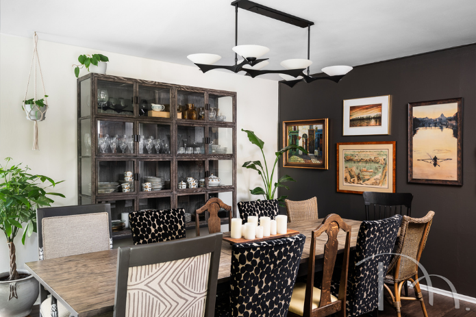
My dining room is always dinner-party ready, with an industrial-style table surrounded by a Boho Chic collection of chairs in mixed textures and fabrics, including family heirlooms that are 100-150 years old, 12 year-old Parsons chairs recovered in a bold black oval velvet and two 25-year-old Sheraton arm chairs outfitted in tribal and tweed. Mixing styles is typical of Boho Chic. It’s all illuminated by a stunning new chandelier from Hubbardton Forge that is reminiscent of the Brutalist movement of art and architecture.
My “china cabinet” on the other hand, is a midcentury modern design that perfectly displays my collection of Christian Dior Casablanca china (yes, I have cheetahs and palm trees on my china). Live plants soften the room’s edges, and an accent wall painted in Sherwin-Williams 2021 Color of the Year, Urbane Bronze is an awesome, moody backdrop for a few of my favorite art pieces.
DID YOU KNOW? Raw materials, textured surfaces, simple silhouettes and geometric shapes are the hallmarks of Brutalist interior design. The trend comes from the post-Mid-Century era which celebrated grandeur, glam, geometric forms and repetitive patterns. (via Vault Luxury Accents)

LIVING ROOM
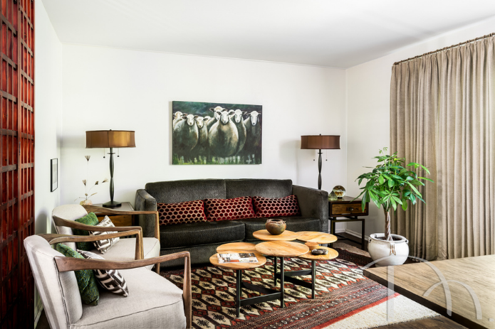
Also on the main floor and open to the dining room, the living area is just the right size for entertaining guests before dinner or lounging after work. I anchored the space with a gorgeous, plush, hand-knotted Bokhara rug, angled on top of a wool rug. To add a touch of elegance, I had my Hollywood Regency Style sofa upholstered in dark brown embossed velvet. A whimsical painting of sheep by local artist Nancy Berndt keeps the space from getting too serious. What you can’t see behind the drapes in this space is a large deck for outdoor entertaining.
DID YOU KNOW? Bokhara rugs originated in the Bokhara region of modern-day Uzbekistan and were made by the Tekke tribe. Today, these beautiful art pieces are designed and crafted all across the carpet-weaving world, including Pakistan, India, Iran, Turkey, Turkmenistan, Uzbekistan and Afghanistan. Bokhara rugs feature symmetrical patterns and diamond-shaped or oval repeating motifs. (Via Qualeen)
FAMILY ROOM
The eclectic vibe (a blend of Art Deco, Midcentury Modern and Boho Chic) continues in the lower level family room, where sectional seating can handle six people, or provide a stretched-out space for me to enjoy TV on my own. Lots of mismatched pillows keep it comfy.
Second “good decision” – The fabulous art deco rug, which takes center stage in this room is from Asadorian Rug Company. I coveted this amazing rug for years before I finally decided to go for it and bring it home. Everything about the rug is so me. I just had to have it. Multi-function drink tables that don’t hide the rug’s great design are ideal here, and a long wall of draperies adds continuity and ground-level privacy.
Adding interesting pieces to a space is always important in the designs I create for my clients. And of course, that is important in the design of my own home, as well. Lighting is a great place to be creative, so I chose a fun hanging light for this space as well as a whimsical lamp and placed it on an equally whimsical “hand” chair.
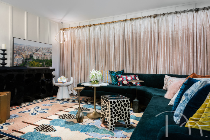
Photo by Karen Palmer
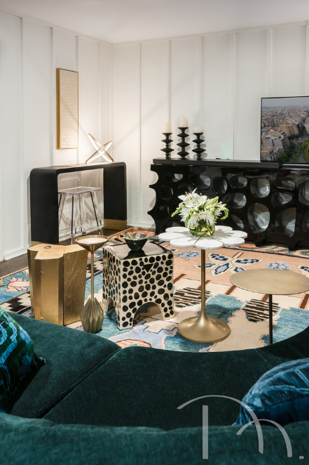
Photo by Karen Palmer
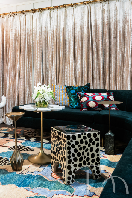
Photo by Karen Palmer
HOME OFFICE
Once COVID hit, and we were forced to close our office and start working from home, I was so grateful that my home office had a view of my backyard through the patio doors. I am constantly entertained by the deer, squirrels and birds. My ever-present feline companion, Isabel, sleeps nearby as I work and makes sure I take frequent breaks by demanding attention on a regular basis.
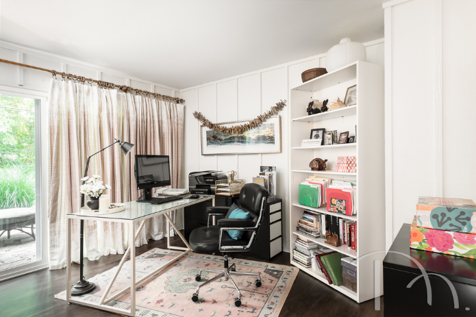
Photo by Karen Palmer
MASTER BEDROOM
On the third level, my master suite offers private “tree house” views, which allowed me to use simple sheers at the windows. I added the Art Deco chairs and a contemporary dresser along with a painting by local artist Carey Johnson of Mountjoy Designs, add personality to the space.
Second “get over it” decision – The brick wall was a decorating hurdle for me. I wasn’t a fan of the exposed brick, but I wasn’t allowed to paint it either. So, my color scheme and décor choices had to be “brick friendly.” I accomplished this by choosing neutral bed linens that didn’t fight with the “busyness” of the brick and pillow fabrics that complemented the varying colors in the brick itself. Outside, a small private balcony is the perfect spot to enjoy breakfast alfresco…maybe even a mimosa?
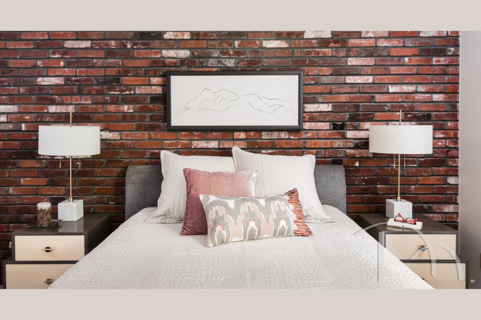
Photo by Karen Palmer
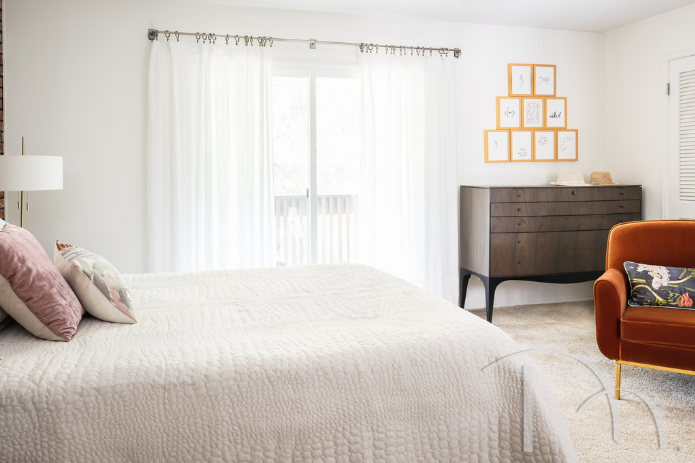
Photo by Karen Palmer
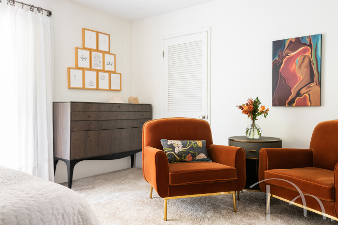
Photo by Karen Palmer
GUEST ROOM
Also on the third level, the guest bedroom is a great example of how to decorate without great expense. The furniture all came from my previous home, and the linens, window treatments and accessories were bargain finds−absolute proof that beautiful doesn’t have to break the bank.
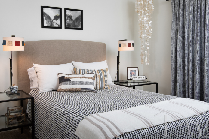
Photo by Karen Palmer
So there you have it…three floors of fabulous…in a rental! I hope you’ve enjoyed this tour of my own home. I never thought I’d love a rental as much as I love this one. With the exceptions of an imperfect kitchen and baths, ingenuity and creativity allowed me to create a nearly perfect home that is totally me. And the freedom from homeowner responsibility that comes from living here is unbeatable!

If you like my blog, please SUBSCRIBE, and I’ll send you my latest posts directly to your inbox!

