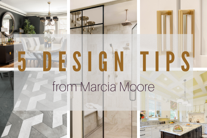
Today I’m starting a new blog series called “5 Design Tips.” This week’s tips are from me. The next installment of this series will feature 5 Design Tips from our senior designer, Kathleen Matthews. There are so many little tips and tricks that go into designing and decorating a beautiful and functional space, and I thought this would be a fun way to share those tips and tricks with all of you. I hope you enjoy this series and take away a little bit of design wisdom. So here we go!
Primary baths should rejuvenate and refresh in the morning and relax and calm in the evening. A beautiful and functional primary bath is one of the ultimate home luxuries, and I love creating these havens for my clients. Here’s one of the newest primary baths we designed.
(left): Truly the ultimate spa experience, this fabulous shower includes a long stone bench to relax on while allowing the 9 (yes I said 9) rainshower heads to gently caress your aching body.
(right): A gorgeous vanity with three equally gorgeous mirrors and traditional sconces highlight this “get ready” space. A stunning gold chandelier (peeking through the mirror) is a beautiful finishing touch.
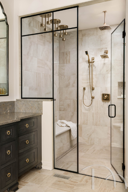
Design by Marcia Moore | Photo by Karen Palmer
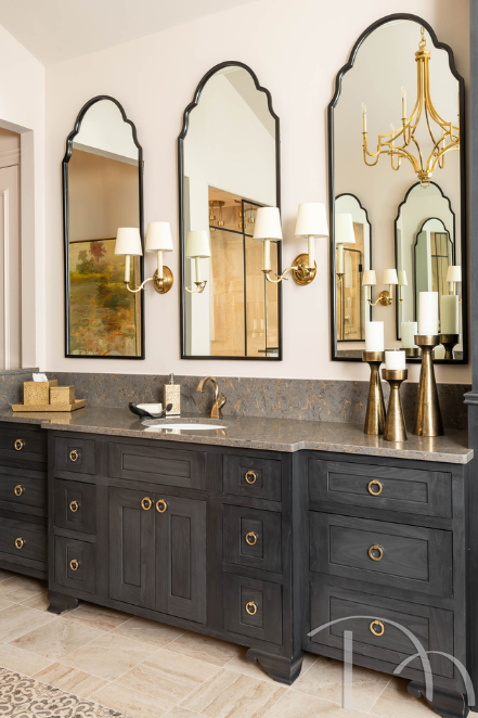
Design by Marcia Moore | Photo by Karen Palmer
A few years ago (pre-Covid), I took an amazing trip to Greece. It was fabulous in so many ways, but as a designer, it really validated for me how much the past informs the present in how I perceive design and what I create for my clients. The blend of old and new, modern and rustic, ancient meeting 21st century is very intriguing to me.
(left): Mosaics and patterns were a big influence in ancient times, especially on flooring. The geometric pattern on this floor was created in mosaics and has a 3D effect.
(right): This is a geometric floor at Gordon Ramsey’s restaurant in Heathrow Airport where we had a layover on our way home. It also has a 3D effect, which made it hard to look at while walking on it.
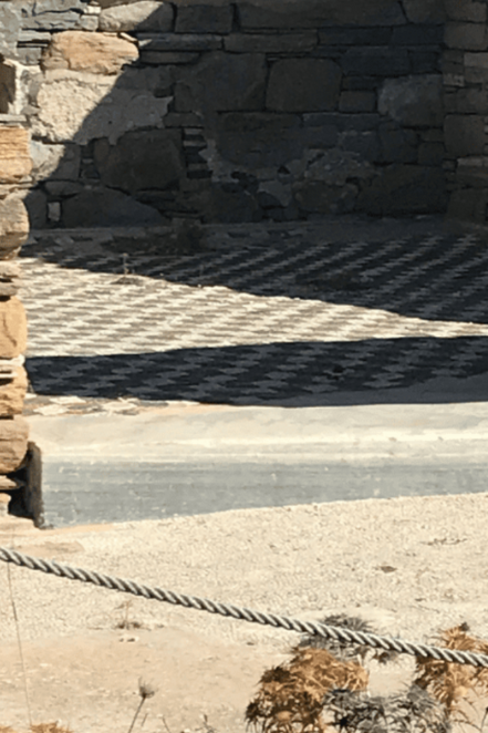
Photo by Marcia Moore
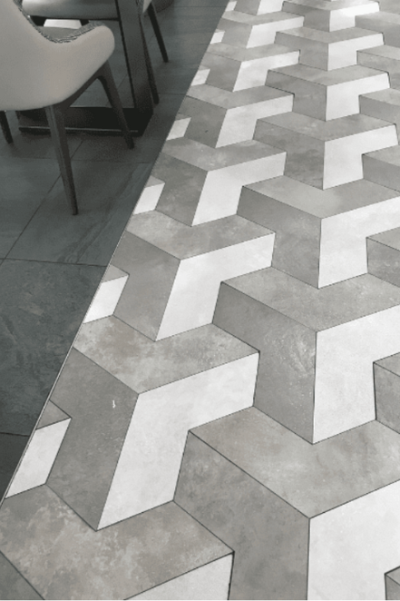
Photo by Marcia Moore
(left): Our client loved the black and white patterned floor we chose for their powder room so much that we continued it up the wall behind the vanity for major dramatic effect.
(right): A random patterned tile floor in this bathroom gave the neutral palette a jolt of interest underfoot.
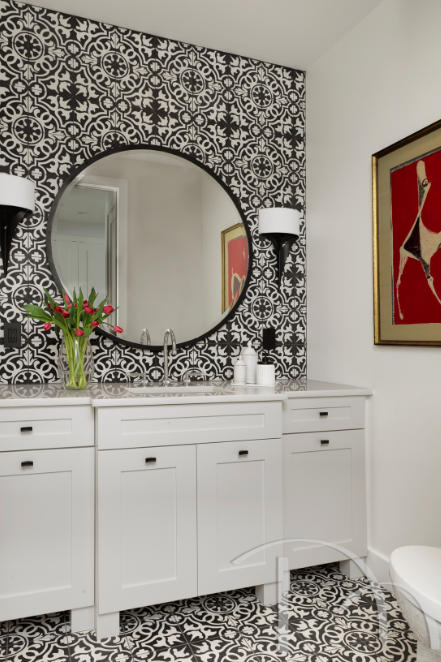
Design by Marcia Moore | Photo by Alise O’Brien
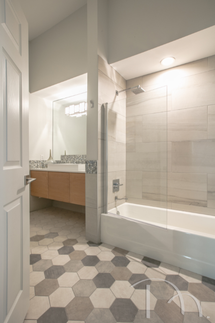
Design by Marcia Moore | Photo by Suzy Gorman
The fifth wall, otherwise known as the ceiling, is often overlooked but essential in a room’s design and décor. This is a perfect spot to really go all out and take your room over the top with personality and pizzazz.
Architectural design elements give your ceiling a healthy dose of charm, character and beauty. From the smallest detail to the most intricate design, architectural elements can have a huge creative impact and become the most significant finishing touches of all. Architectural details take what’s overhead, over the top.
We designed a striking coffered ceiling to mimic the floor’s wood inlay in this century home in University City, Missouri. A wash of soft yellow paint finishes the look.
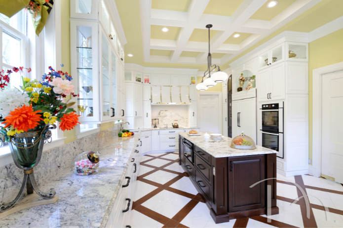
Design by Marcia Moore | Photo by Michael Jacob
Just as painted ceilings are rooted in the past, so are highly decorated ceilings; think ornate plaster treatments or colorful frescos. Today, wallpapers, faux painting, stencils and murals can make the space over your head worthy of a look up.
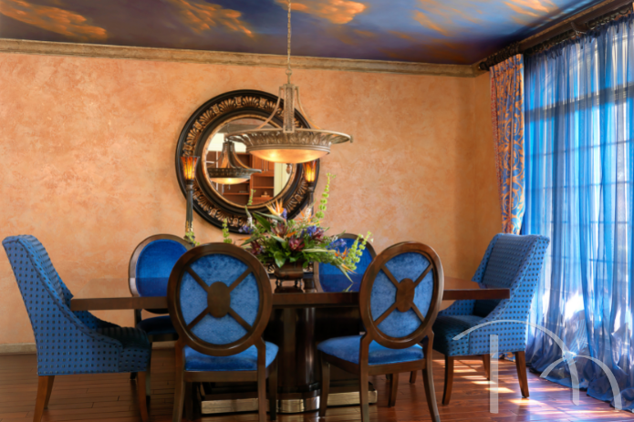
Faux painted to resemble a Tuscan sunset, the spectacular ceiling in our client’s dining room is an unexpected and dramatic addition overhead.
Often, it truly is the little details that make the design. Cabinet pulls are a great example. Once the cabinetry goes in, we take the time to really think what knobs, pulls or handles will be the most beautiful or whimsical and also functional. Think of cabinet pulls as the perfect necklace on a little black dress. The dress is great on its own, but add that necklace, and pow, the outfit becomes a statement.
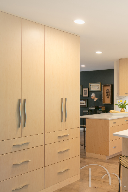
Design by Marcia Moore | Photo by Suzy Gorman
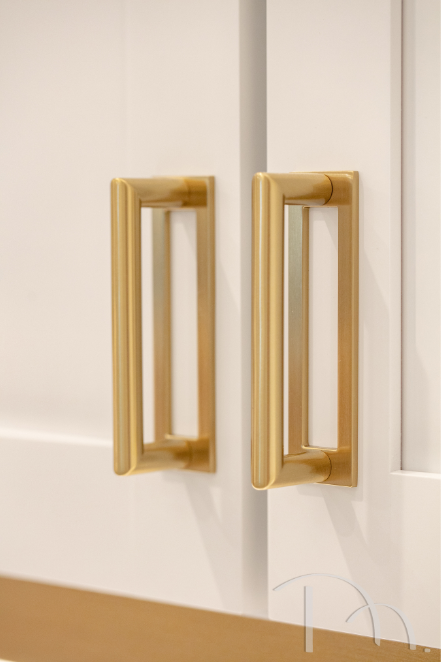
Design by Marcia Moore | Photo by Suzy Gorman
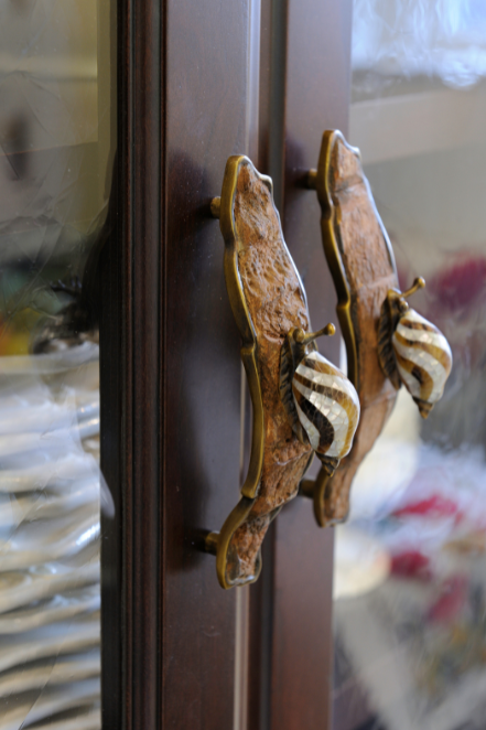
Selected by Marcia Moore | Photo by Michael Jacob
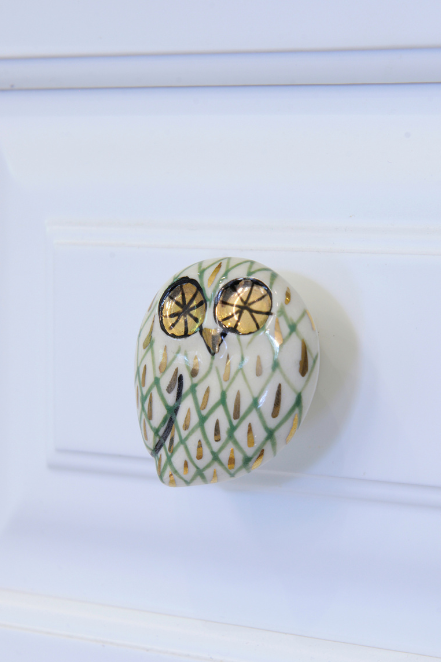
Selected by Marcia Moore | Photo by Michael Jacob
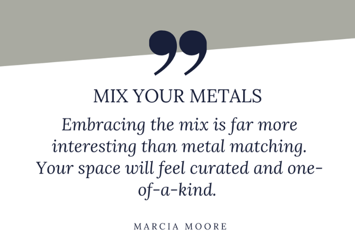
Oil and water may not mix, but silver and gold absolutely do. In fact mixing metals of all types is an easy and stunning way to make a room look collected rather than just decorated. Design is really all about the mix more than the match. That doesn’t mean that you can’t match some things, but mixing metals, textures, patterns and colors is a sure way to add interest, personality and a pop of the unexpected to your room.
(left): In this classic contemporary dining room, designer Kathleen Matthews mastered the metal mix. Note the gold lamp bases, silver chandelier and brass and black vases on the table. The tabletop is champagne colored (perfect for a dining room, don’t you think?), which is halfway between gold-brass and silver/chrome.
(right): In this primary bedroom, Hollywood glam gets a dose of Moroccan flair. The soft, almost brushed silvers and golds in this space give it just enough sparkle to enhance but not overwhelm this room that already has a lot going on.
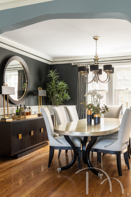
Design by Kathleen Matthews | Photo by Karen Palmer
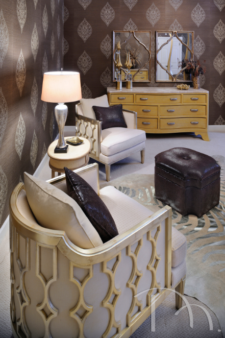
Design by Marcia Moore | Photo by Michael Jacob
So that’s a wrap on our first installment of Design Tips. I love being able to share the insider tips and tricks that take design over the top. Be on the lookout for the next installment coming next month, when senior designer Kathleen Matthews will be sharing the inside scoop.
Until next time,


