Let’s Talk About Color Drenching…
I love color-drenching. I want to say that first, before I say anything else, because the design internet has a way of turning every interesting idea into a minefield of “mistakes to avoid.” That’s not what this is.
Color drenching is one of my favorite approaches in all of interior design. Not because it’s trending, and not because it photographs beautifully, though it does. I love it because of what it does to the feeling of being in a room. Most interiors divide themselves: wall color here, ceiling color there, trim in something else entirely. Your eye is constantly clocking the transitions, registering where one surface ends and another begins. It’s subtle, but it adds up. The room feels assembled rather than whole.
When you drench a room in one color, all of that stops. The eye has nothing to chase. The surfaces dissolve into each other, and the room becomes an experience rather than a composition. I describe it to clients as the difference between looking at a room and being in one. That shift is something I find genuinely exciting every single time.
So what exactly is it?
Color drenching means committing one color to the whole room. Not just the walls. The ceiling, the trim, the door frames, the doors themselves. The entire envelope. If you’ve seen a room where every surface is the same color and thought it felt impossibly chic or surprisingly cozy, you were probably looking at a drenched room.
The ceiling is the piece that surprises people most. Most of us were raised with white ceilings as the default, so painting the ceiling the same color as the walls feels like a leap. But the ceiling is a surface like any other. When it’s a different color, it reads as a lid on the room. When it’s in the same family, the envelope closes and the whole thing comes together. The ceiling is actually the key.
It works in bold, saturated color. It works in quiet, restful color. It works in white. The specific color matters less than you’d think. What matters is the commitment. A half-drenched room, where you’ve done the walls but left the ceiling or trim untouched, tells a different story than a fully committed one. Go all the way, and something changes.
One of the things that surprises people most about a finished drenched room is how alive it feels. Because every wall is oriented differently and the light hits each surface at a different angle, the same paint color can read as four subtle shades throughout the day. The wall that catches morning sun looks warmer and brighter. The wall in shadow reads deeper and moodier. As the sun moves, the room shifts with it. Far from feeling monotonous, a well-drenched room is constantly changing. It’s one of the most layered looks you can achieve, and the irony is you got there by using a single color.
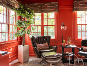
This room will help wake you up along with your cup of coffee in the morning, and cocoon you at night while you read a book./ Photo by Karen Palmer
The boldest example in our portfolio is a sunroom we drenched floor to ceiling in orange-red. Walls, ceiling, window trim, window frames, wainscoting: all the same color. Every surface committed. That room doesn’t have a color applied to it. It IS the color. When you stand in the doorway, the whole space wraps around you before you’ve taken a step inside. That’s the experience drenching creates when it’s taken all the way.
What I love about this room in particular is that it’s tucked off the main living space, a room you step into rather than pass through. That context suits drenching perfectly. It becomes a destination. You leave one space and arrive somewhere entirely different. The color is what makes the arrival feel intentional.
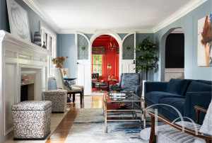
I love the play of soft and vibrant between these 2 rooms. You can’t help but be drawn in by the enticing red-orange walls./ Photo by Karen Palmer
Now, white. Because I want to make sure this doesn’t read as a concept that only applies to people who want a bold, dramatic room. Some of my favorite drenched rooms are quiet. I drenched our own studio kitchen in white: walls, ceiling, cabinetry. One color, full envelope. What made it work was finish variation: flat sheen on the walls and ceiling, satin on the doors and trim. Same white everywhere, different behavior under light. The room feels unified without feeling flat. It’s bright without being clinical.
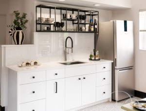
Our entire office has a backdrop of Sherwin-Williams Snowbound – a rich, warm white that is my favorite shade of white. It is the perfect balance to all the colorful wallpaper, art, and designs-in-the-works that cover the rest of the office./Photo by Karen Palmer
___________________________
That finish variation is worth knowing about: for whites and lighter colors, flat on walls and ceiling, satin on trim and doors. For richer, deeper colors, I’ll often go eggshell or satin on the walls too. A bit of sheen keeps a deeply saturated room from feeling heavy because higher gloss reflects more light back into the space. The ceiling almost always stays one sheen lower than the walls, regardless of what color you’re working with.
Paint last. Always.
Here’s the part that changes the outcome more than any other single decision: paint is the last choice, not the first. Not because the color matters less, but because the color can only be perfected once you know what the room is doing. Its light, its architecture, its furniture, what you want to feel when you’re in it.
A drenched room that disappoints almost always starts with the color. Someone found an inspiration image, chose the paint, and discovered that their room and that room were two different things. They were. The furniture in that inspiration image was chosen knowing the color was coming. The lighting was specified around it. The whole room was designed together. When you choose the color first, you’re working backward through someone else’s decisions.
Start with the room. What direction does it face? What’s the natural light doing? What’s going into it? Then sample the color: large swatches up against your fabrics, tile, wood finishes, etc., viewed at different times of day. A chip in the store is a starting point, not a commitment. The commitment comes after you’ve seen it live in your specific light for a few days. DESIGN TIP: I don’t recommend putting large paint samples on your walls, because all they do is pick up the existing wall color, which dramatically changes the way the sample looks. Judge the color with the other items chosen for the room for a much better chance of success.
We have a Lafayette Square project in progress right now that will be using color drenching, and I can’t wait to show it. The photos are still months away, but when they’re ready, I’ll do a proper follow-up. In the meantime: if there’s a room in your home you’ve been thinking about doing something bolder with, I’d love to hear about it. And if you want to think this through before buying a single quart of paint, that’s exactly what I’m here for.
Ready to have that conversation?
Book a consultation → marciamooredesign.com/contact