Designing with Boundaries: Why Constraints Spark Creativity
Some of the most transformative design stories don’t begin with boundless freedom. They begin with boundaries. At Marcia Moore Design, we know that limitations can become launchpads for creative genius—if you know how to listen to what the space is trying to say.
Take, for example, a downtown St. Louis loft in the historic Printer’s Loft building. It was brimming with character: exposed ductwork, towering concrete columns, brick walls, and vast stretches of unbroken wall space. Beautiful? Absolutely. But easy to design around? Not exactly.
Our clients loved the industrial charm of the space, but they wanted something warmer, more glamorous—something distinctly them. The question was, how do you soften such a hard-edged space without erasing the very elements that give it soul?
We didn’t fight the architecture. We leaned in.
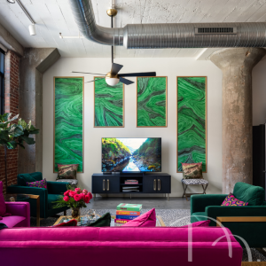
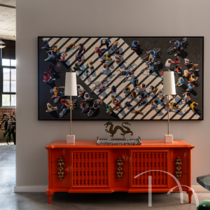
Large faux painted wall panels keep the TV from being the uninteresting focal point of this room./photo by Karen Palmer.
___________________________
Let’s start with the largest wall in the living room. Rather than attempt to cover it with random artwork or oversized decor, we turned it into a canvas. We added traditional applied molding, painted antiqued gold to create a framed panel effect, like you might see below a chair rail or in a classic library. Inside those frames? A faux malachite finish hand-painted by an artisan. It looked like stone, with swirls of emerald and rich texture, but it was all paint and imagination. Luxe, without the weight. Dramatic, without distraction.
This molding treatment not only brought texture and color to an otherwise blank wall, but also became a way to direct the eye without overwhelming the room’s focal point: the television. The wall now told a story—one of refinement, restraint, and quiet drama.
And that was just the beginning.
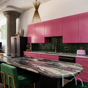
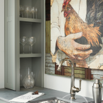
The drama begins with an exotic marble countertop that incorporates all the colors used throughout the rest of the kitchen./ Photo by Karen Palmer.
___________________________
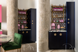
In the open kitchen, we embraced a Hollywood Regency vibe, choosing bold pink cabinetry and a marble countertop laced with pinks, purples, greens, and blues. That countertop became the design compass. On the opposite side of the space, we created a tea and coffee bar with cabinets painted in a rich cobalt blue, paired with a geometric tile backsplash and floating gold-framed glass shelves. Every color was a deliberate echo of the stone’s natural variation.
Designing within limits isn’t about compromise. It’s about clarity.
When you embrace what a space already has to offer—even its supposed flaws—you open the door to discovery. That’s where the real magic begins.